
Looking at Reported Hate Crimes

“It is important to understand what you CAN DO before you learn to measure how WELL you seem to have DONE it.” — John W. Tukey (1977, p. v)
This investigation was instigated by the horrific events of October 27, 2018, when Joyce Fienberg, an old and dear friend, was one of 11 congregants murdered in Pittsburgh’s Tree of Life synagogue (Pittsburgh Post-Gazette, 2018); Joyce was the widow of famed statistician (and founding editor of CHANCE) Stephen E. Fienberg. As time passed, we grew numb, but the spirit of Tikkun Olam kindled the desire to try to do something. But what?
Tikkun Olam is the transliteration of the Hebrew phrase ![]() which means “repair the world” and is a concept in Judaism that dates back nearly 2,000 years; it is interpreted by many Jewish denominations as an aspiration to behave and act constructively and beneficially.
which means “repair the world” and is a concept in Judaism that dates back nearly 2,000 years; it is interpreted by many Jewish denominations as an aspiration to behave and act constructively and beneficially.
We are statisticians (and Jews), so our path to understanding and thus perhaps diminishing the likelihood of the recurrence of such terrible events begins with looking at data. This account is the start of our empirical search for understanding.
The path to understanding is paved with questions whose answers provide illumination. Although many of these questions are causal, we must begin with some obvious questions whose answers are descriptive. Three categories of questions that require descriptive answers are:
1. How extensive is the problem—how often are incidents of hate crimes reported? Who are their victims? How does their frequency of occurrence differ by target group?
2. Are matters getting better—or worse? Are there discernable trends associated with outside events? Are time trends in reported hate crimes different from trends in other crimes?
3. Are there unusual outcomes associated with particular combinations of target group and time period?
Data that would illuminate these issues show the frequency of each type of crime as a function of time, so the categories of questions can conveniently be characterized as crime effects, time effects, and interactions.
The FBI’s National Crime Reports began reporting hate crimes in 1996, but because the New Jersey State Police effort began eight years earlier (in 1988), the first data sets we examined were bias incident reports published by the latter (reports since 2006 are available online). We looked specifically at the annual number of reported incidents of anti-Black, anti-Semitic, and anti-Hispanic crimes in New Jersey from 1988 until 2018.
The first thing we did was graph the data and look at them (Figure 1).
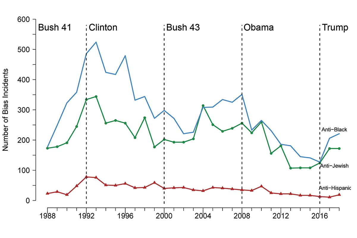
Figure 1. Number of bias incidents in New Jersey from 1988 until 2018 for three groups of people.
The plot provides some rudimentary information, and perhaps some surprises. Most bias incidents were against African Americans, closely followed by incidents against Jews. Many fewer incidents against Hispanics were reported.
In designing this plot, we followed a centuries-old graphic tradition of including markers indicating the identity of the ruling national administration (Playfair. 1821; also Wainer. 2007—see Appendix/Figure A1). This action paid immediate dividends: There were increases in the number of bias incidents during Republican administrations (the biggest during the final four years of the Bush 41 presidency) and declines during Democratic administrations.
Interpretation of the relative number of incidents is difficult, though; we don’t know whether one group is targeted more often because there are just more of them (about 14% of New Jersey’s citizens are African American versus 6% are Jews), because they are more-hated, or because of differential reporting rates in these groups. It is also difficult to compare across time if the number of members of the group changed radically over the 30 years (the proportion of New Jersey residents who identified as Hispanic grew from 8.8% in 1988 to 20.6% in 2018).
Fortunately, the difficulties in interpretation caused by different sizes of the groups in question can be dealt with easily by transforming the number of incidents to rates of incidents per 100,000 in that particular population of potential victims.
Using publicly reported population data from the decennial census (State of New Jersey Department of Labor and Workforce Development. 2020), we obtained New Jersey Jewish, Black, and Hispanic annual population estimates through linear interpolation for the 30-year period and then used those data to convert the number of bias incidents to rates.
Figure 2 shows the rates of bias incidents in New Jersey. The most-profound change from the display of raw counts that we see is the reversal of position of bias incidents against Jews with those against African Americans. In New Jersey during this 30-year period, the rate of acts of anti-Semitism is much higher than the rate of acts of racism against African Americans, but the pattern of increases in rates of bias events during Republican administrations and declines during Democratic ones persists. While there seems to be an increase in bias crimes in the first two years of the Trump administration, the overall level of such crimes did not reach where it was at the end of the four years of the Bush 41 administration.
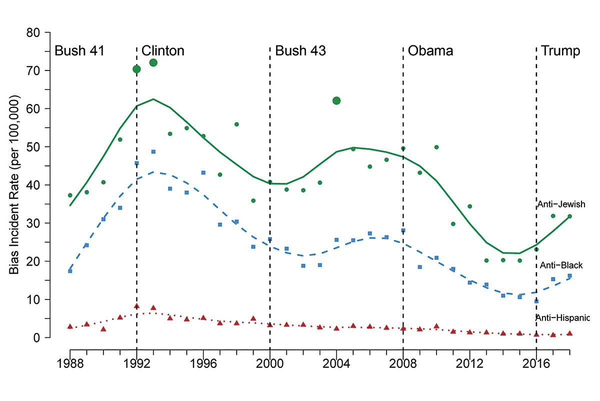
Figure 2. Bias incidence rates (per 100,000 in the population) in New Jersey from 1988 until 2018 for three groups of people. Smooth curves derived by fitting third-degree splines.
Stanford statistician David Donoho, focusing on interactions, observed that the datapoints indicating incidence of crimes against Jews in 1992, 1993, and 2004 seem uncharacteristically high (those points are emphasized in plot), and coincide with the Gulf and Iraq wars, “but why those events show up in anti-Jewish results is unclear to me” (D. Donoho, personal communication. January 31, 2020).
Donoho’s observation illustrates how difficult it is to remain descriptive and resist the temptation to think about possible causes. For now, we will follow Tukey’s advice (always a wise strategy), which was featured at the beginning of his iconic book as well as this essay, and stick with observing and describing what we see.
Figure 2 contains answers to the first two questions, but we still do not know if the pattern of hate crimes is different from all other crimes. Do murders or burglaries or robberies or other kinds of crimes follow the same pattern that we see for hate crimes? The short answer is “not so much.” The temporal patterns of hate crimes seem to be different.
Figure 3 provides a compound plot of nine other crimes. All nine crimes show a gratifying decline over the 30 years shown, but with little of the fluctuations with each administration that characterize hate crimes. All but rape and murder occur much more frequently than hate crimes (see Figure 4, which shows the median number of crimes of each sort over these 30 years, plotted on a log scale). Murder is much less frequent than hate crimes, but rape (itself a hate crime) occurs with about the same likelihood as the other hate crimes reported. It is also unique in showing the same upturn during the Trump administration.
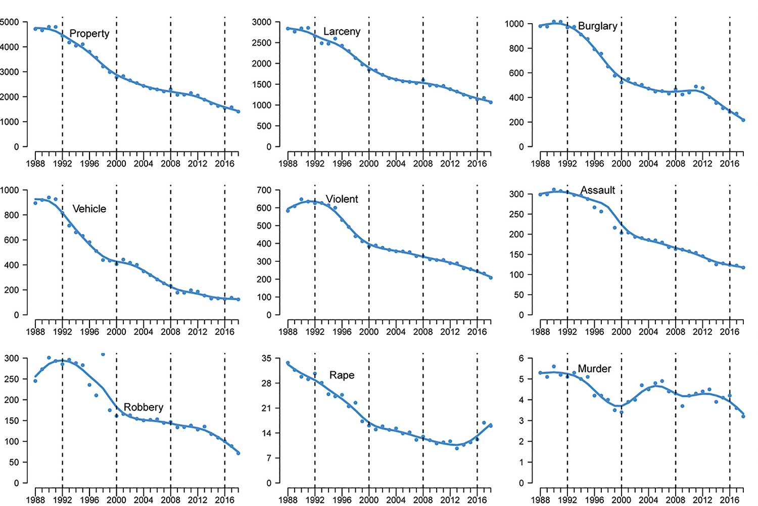
Figure 3. Crime rates per 100,000 in the population for New Jersey from 1988 until 2018, with vertical lines demarking the five presidential administrations.
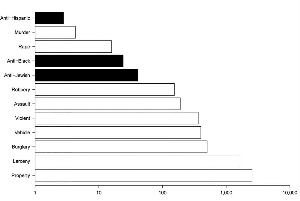
Figure 4. Median annual crime rates per 100,000 in the population for New Jersey from 1988 until 2018, shown on a log scale.
The similarities observed in the temporal patterns among different crimes that are visible in Figure 3 are numerically characterized in the correlation matrix in Table 1. The correlations reinforce our observation that while all crimes follow similar temporal patterns, there is something special about hate crimes; perhaps in the way they are motivated or in the way they are reported. The close linear association between bias incidents against Jews and Blacks is made obvious in Figure 5.
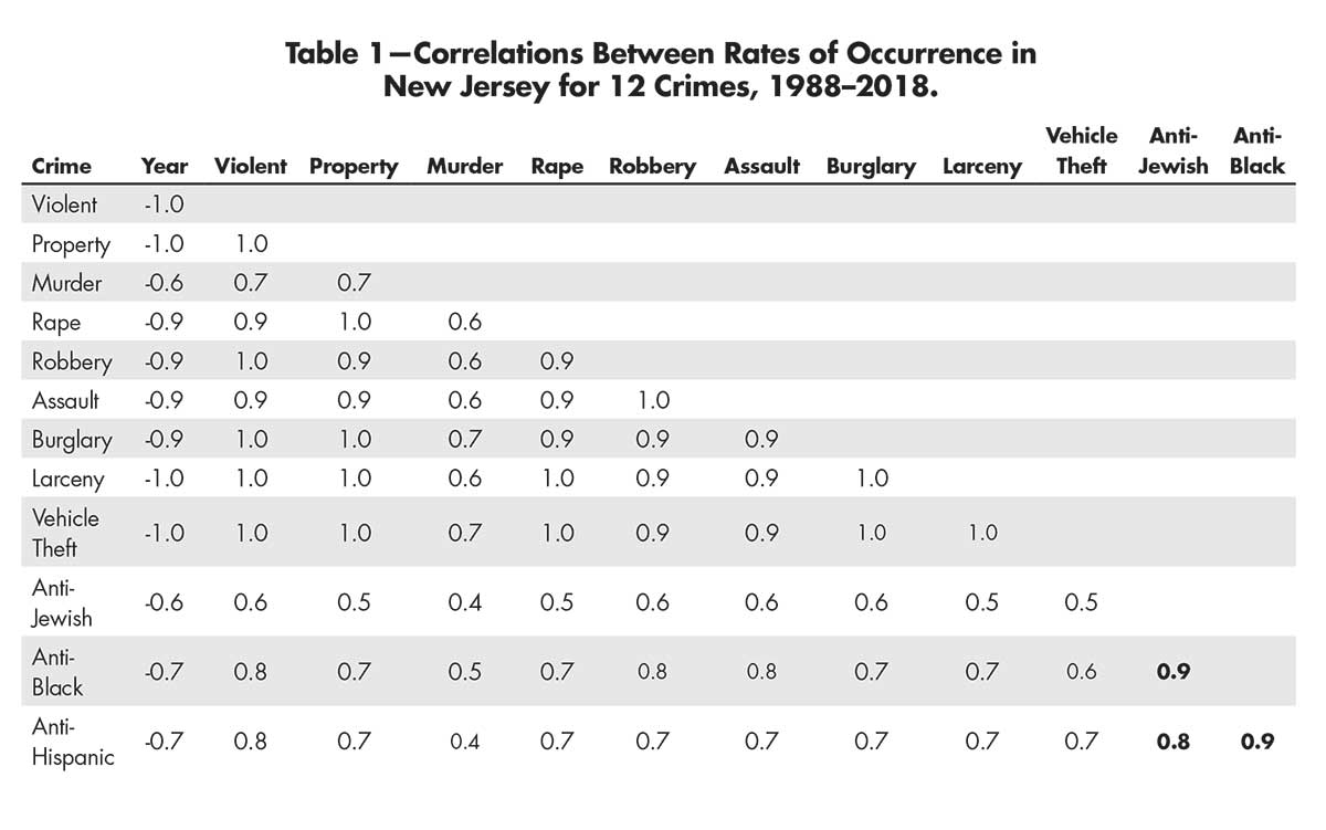
Table 1—Correlations Between Rates of Occurrence in New Jersey for 12 Crimes, 1988–2018.
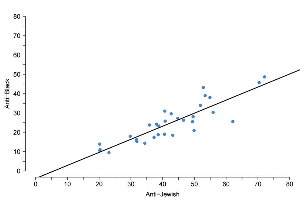
Figure 5. Scatter plot of the annual incidence rates of bias crimes in New Jersey against Jews vs. Blacks over the studied period of 30 years from 1988 to 2018.
Are the observations we have made about hate crimes unique to New Jersey, or do we observe much the same pattern nationally? Figures 6 and 7 are parallel plots to Figures 1 and 2, using national data (Berman Jewish Databank. 2020; Federal Bureau of Investigation. 2020; United States Census Bureau. 2020). National data over the time span available follow, to some extent, three of the same patterns that we observed in New Jersey. Specifically:
1. The rank ordering of the three groups in terms of the rate of hate crimes is the same.
2. There is an overall decline in the frequency and rate of hate crimes over the years for which data are available.
3. There is an upturn in anti-Jewish crime in the Trump administration.
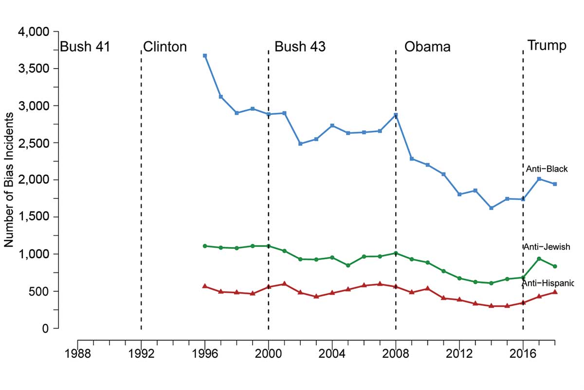
Figure 6. Number of bias incidents from 1996 through 2018 from National Crime Reports.
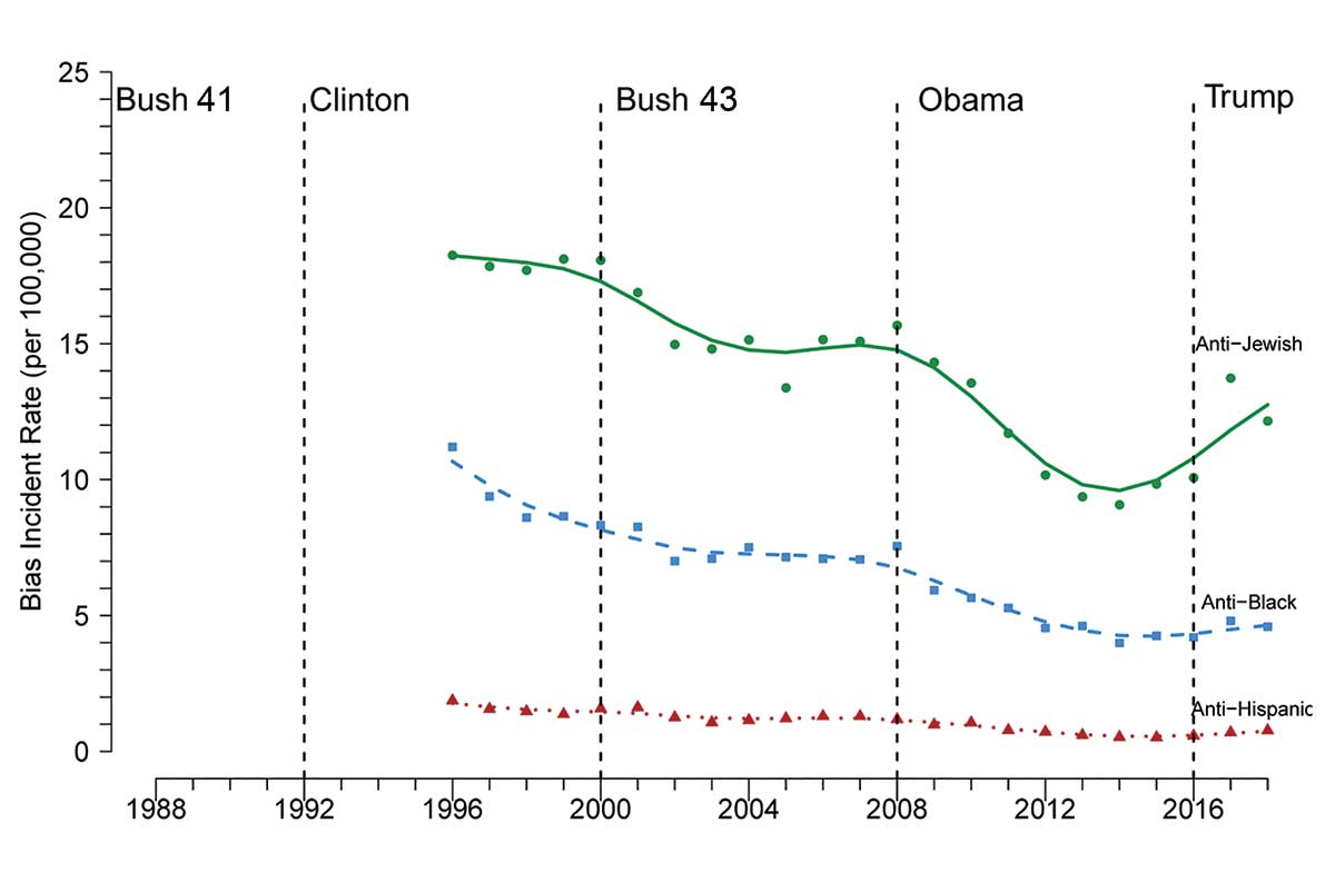
Figure 7. Bias incident rates (per 100,000 in the population) from 1996 through 2018 from National Crime Reports.
Discussion
The simple graphical tools we employed to look at New Jersey crime data over the past 30 years provide the beginning of understanding. Over these 30 years, there has been a generally steady decline in all crimes, but the decline in hate crimes reported by New Jersey is not steady; it ebbs and flows with the political party that holds the White House, rising under Republican administrations and declining during Democratic ones. The rates of bias crimes against Jews is greater than the rates against African Americans, but those rates are highly correlated with one another. Apparently, people who hate lash out in lockstep with one another.
While some of the patterns observed in the New Jersey data could be unique to the Garden State, some aspects of those patterns in the more temporally limited national data suggest that at least in those aspects, New Jersey is not unique.
It is important to emphasize two points made earlier:
(1) The national data were drawn from the FBI’s Uniform Crime Reports, which only began listing hate crimes in 1996, while the New Jersey data begin eight years earlier.
(2) All of these data are reported incidents. Tools such as the National Crime Survey have revealed that true rates can be quite different than reported rates—rapes, for example, have historically been under-reported. We suspect that some bias crimes, especially those against Hispanics, probably share a similar fate, but because these data sets might be contaminated by differential reporting rates does not prevent them from being useful, and the patterns they reveal are certainly suggestive.
The suggestions generated by the descriptive displays shown previously fairly scream for causal interpretation. Four obvious causal questions stem from the full data analysis:
1. What national policy dictated by the party holding the White House causes the observed changes in the frequency of bias incidents? More carefully stated, what is the causal effect on the frequency of reported hate crimes of various national policies?
2. Why are Jews and Blacks singled out for victimization? What are the parallel rates of anti-Muslim crimes?
3. Other than political causes, many other significant historical and cultural events and trends occurred in the past 30 years that may contribute as explanatory factors. What is the causal effect on the frequency of hate crimes of:
- a. Rise of the internet
- b. Financial crisis
- c. Terrorism/September 11
- d. Seemingly unending stream of mass shootings
- e. Growth of social media
4. Are there other, more-global factors, that are influencing hate crime patterns beyond U.S. political, historical, and cultural trends?
Three causal questions stemming from the New Jersey analysis are:
1. What happened during the Bush 41 administration that was worse, in this regard, than what happened during the Trump years?
2. Did the Gulf War and the Iraq War cause an increase in anti-Semitic incidents? If so, why?
3. What state and local policies affect changes in frequency of bias incidents? We did not feature New Jersey leadership in this exploratory analysis.
We must leave exploration of these critical causal questions to subsequent accounts that could make use of a vastly expanded data gathering effort, where the choice of possible explanatory covariate information could be informed by the suggestions seen in these data.
Appendix
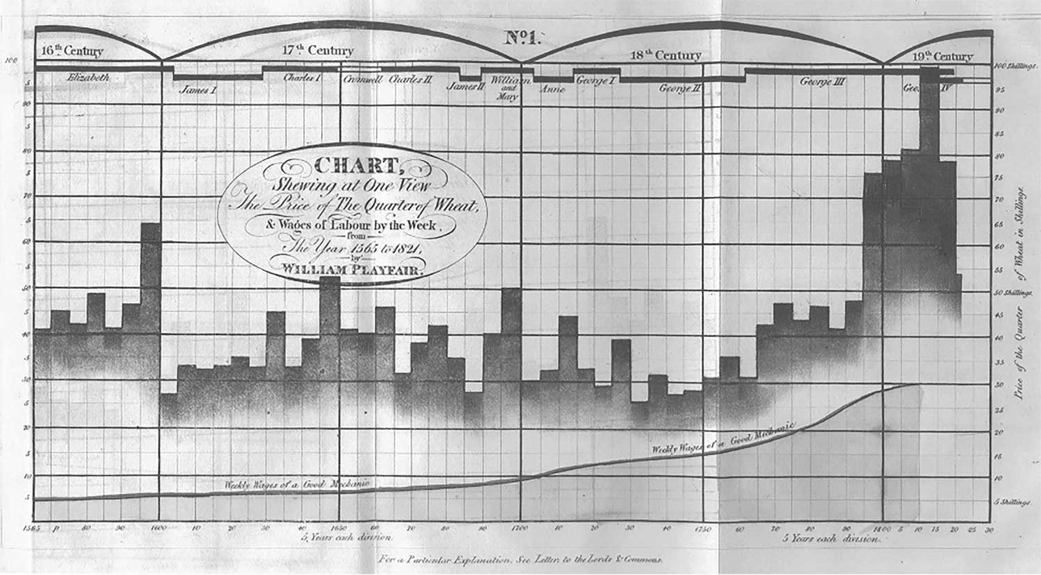
Figure A1. A graph from Playfair (1821) containing two data series ranging from 1565 to 1821 that are meant to be compared. The first is a line that represents the “weekly wages of a good mechanic” and the second is a set of bars representing the “price of a quarter of wheat.” At the top of the chart, the time segments are marked by the name of the ruling monarch, from Elizabeth I to George IV.
Further Reading
Berman Jewish Databank. January 22, 2020. United States Jewish Population, 2018.
Federal Bureau of Investigation. January 22, 2020. Hate Crime Statistics.
Pittsburgh Post-Gazette. October 28, 2018. Joyce Fienberg, longtime Pitt researcher, devoted grandmother.
Playfair, W. 1821. A letter on our agricultural distresses, their causes and remedies: accompanied with tables and copper plates, shewing and comparing the rice of wheat, bread, and labour from 1565 to 1821. 3rd ed. With an additional chart. London: Sams.
State of New Jersey Department of Labor and Workforce Development. January 22, 2020. Population and Household Estimates.
Tukey, J.W. 1977. Exploratory data analysis. Reading, MA: Addison-Wesley.
United States Census Bureau. January 22, 2020. A Look at the 1904s Census.
Wainer, H. 2007. Improving data displays: ours and the media’s, CHANCE 20(3): 8–16.
About the Authors
Howard Wainer is in his post-employment career and lives in Pennington, New Jersey. His latest book is Truth or Truthiness: Distinguishing Fact from Fiction by Learning to Think like a Data Scientist (Cambridge University Press. 2016). His next one, jointly with Michael Friendly, is A History of Data Visualization and Graphic Communication and is scheduled to be published by Harvard University Press in the spring of 2021.
Richard Feinberg is an independent statistical consultant.