
Three Welcome Arrivals for 2023—1. Florence Nightingale

Note: This is the first in a series of three articles.
The era of big problems has ushered in the era of big data. We have learned through painful experience that solutions to complex problems in the absence of supporting evidence typically only make sense if you say them fast. Such supporting evidence can often be found in data, but only if we have the wit to discern it.
Some content is only viewable by ASA Members. Please login or become an ASA member to gain access.
Over the past 250 years, we have learned that graphs are the intermediary between data and understanding. But which graphs? And how do we pair them to which problems? Nick Carroway provided an orienting attitude toward answering these questions in his haunting coda to F. Scott Fitzgerald’s The Great Gatsby:
“So we beat on, boats against the current, borne back ceaselessly into the past.”
And this year, the past, abetted by the formidable assistance of RJ Andrews, has presented us with three beautiful new volumes describing the life and work of important contributors to our modern graphical heritage (see visionarypress.com).
The first of these, Florence Nightingale, Mortality and Health Diagrams, is the subject of this column. In subsequent accounts, I will discuss Emma Willard’s Maps of History and the first English translation of Etienne-Jules Marey’s The Graphic Method.
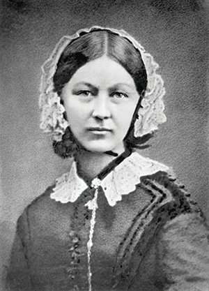
Portrait of Florence Nightingale that opens Mortality and Health Diagrams.
Let Us Begin
“Russia threatened western powers by invading Crimea, a health crisis overwhelmed authorities and public outrage directed political agendas.”
This is not the opening of a book about the 21st century, detailing Putin’s brutal invasions, the COVID pandemic, and Trumpist Maggots; it is about some of the problems facing Florence Nightingale’s 19th-century world that she sought to ameliorate.
Both the content and the appearance of the book grab your attention. A dust jacket in bright colors tells you this is not a typical academic publication. The jacket peels away to reveal a quote from Nightingale (“Whenever I am infuriated, I revenge myself with a new Diagram”) and then, beneath that dust jacket, a close-up of one of those diagrams appears, decorated with gold foil.
Everything about the book’s design and production quality lets you know that RJ Andrews, editor, cares deeply about this story and wants you to appreciate it, too. The book includes full reproductions of Nightingale’s data graphics that unfold from their binding to uncommon scale. You experience Nightingale’s graphics in the way she wanted you to.
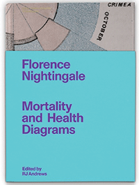
Book cover with partial dust jacket of Florence Nightingale, Mortality and Health Diagrams (Visionary Press, 2022).
What’s Between the Covers?
The book’s first half is a long essay by Andrews titled “God’s Revenge Upon Murder”—a nod to Nightingale’s nickname for her diagrams. Her charts were a righteous and powerful attack against a government system that caused the cruel and unnecessary death of thousands of British soldiers during the Crimean War. The essay fills gaps in both our knowledge of Nightingale and data-graphics scholarship.
Nightingale became famous in early 1855 while at war, managing a battalion of nurses. People have written about her ever since. Relatively recently, Mark Bostridge, Hugh Small, and Lynn McDonald (who also wrote the foreword to Mortality and Health Diagrams) have contributed book-length histories about the famous nurse. But in these and previous works, Nightingale’s data graphics are only acknowledged as curiosities in a sea of other focuses. Her diagrams and their role in helping fight for public health reform are never explained.
The data-visualization community has also long recognized Nightingale as a token woman information-designer, but only superficially, never with the gravity necessary to really appreciate her contribution.
Andrews centers his stories on Nightingale’s diagrams, keeping only the parts of her life that are necessary to understand their creation and impact. One major flashback, which draws on my History with Michael Friendly, explains the prior art that set the stage for Nightingale.
Andrews is obsessed with detailing the long chain of events that explains how Nightingale’s graphics came to be. He describes the effort as craftwork—something that was “hand-wrought and hard-fought.”
Perhaps Andrews, a self-described professional data storyteller, is the first to unearth the story of her graphics because he was the first to bother to take a look. Nightingale is one of the most documented historic lives on record. More than 12,000 Nightingale letters survive. On top of this, he layers insights from publications, newspapers, and hand-drawn drafts of her diagrams that survive at the British Library.
A parallel meta-narrative emerges from Nightingale’s story about the kind of work that’s necessary to produce great data graphics. Andrews seizes Nightingale’s record to create a behind-the-scenes picture of how historic data graphics actually happened. It’s a clearer picture than could be constructed for any other iconic chart-maker, whose records are not as complete as Nightingale’s.</p.
The Nightingale book is one of three inaugural volumes in the Information Graphic Visionaries book series. If you want to attract broader attention to the stories behind great data graphics, you couldn’t do better than by starting with the already popular Florence Nightingale.
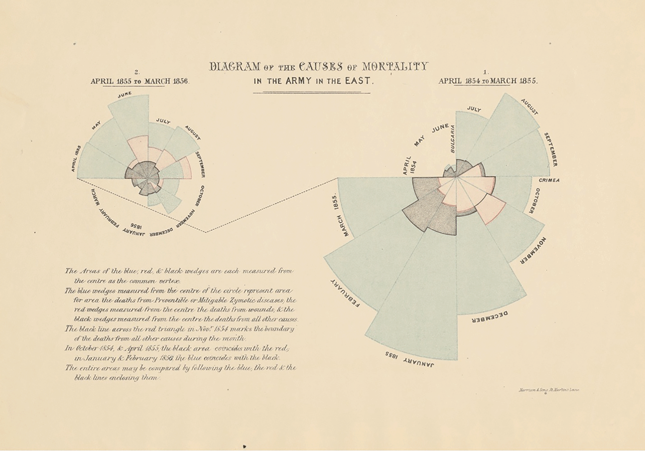
Nightingale’s most famous chart, which she called a “circular diagram,” was the second sheet of a three-act visual story arguing that the vast amount of death was preventable.
What do we learn from Nightingale’s story? How did she create an information design masterpiece?
It is the same as asking why the Wright brothers were the first to fly or even why the Industrial Revolution originated in Great Britain: Breakthroughs happen with the right stew of ingredients. You need a mix of motivated and ingenious individual actors. But that’s not enough. They also have to be operating on a fertile field of circumstances.
Nightingale, the lead actor in this story, contributed a historically unique personality. She went to war with a mix of rhetorical wit and quantitative literacy. On top of this, she had a religious devotion to improving lives through healthcare. At war, she gained months of miserable experiences, witnessing needless death at the hands of incompetent authorities—all the motivation needed to dedicate the rest of her life to the titular “revenge.”
Back home, her family’s financial and caretaking support helped keep her in business. The soft power and connections gained from her fame helped, too, but it was her overall unceasing drive that made the marginal difference.
But she did not do it alone. Nightingale drew on a circle of advisors, a group Andrews calls the reformers. Two men from this circle were critical to her diagrams. William Farr, the great English epidemiologist, inspired and facilitated the creation of her diagrams. He brought civilian registration data, which was necessary for Nightingale’s persuasive argument that compared military and civilian mortality rates. Farr also had a team of clerks with the know-how to make sophisticated data graphics. They had recently produced lavish government reports about cholera and the decennial census.
The other critical person was Sidney Herbert. His political skill helped Nightingale construct and pace her visual and verbal arguments. Once the graphics were printed, Herbert and Nightingale worked closely to make sure they were seen by waging a months-long promotional campaign. Unlike many today, Nightingale and Herbert understood that it was not enough to have the right answer. You have to have the right answer and then beat others over the head with it, over and over.
Environmental ingredients include other actors, such as supplies commissioner and data junkie Alexander Tulloch, or Harrison and Sons, the company that printed the diagrams. Nightingale connected her grievances from war to the ongoing civilian sanitary health movement, successfully propelling both military and public health reform toward progress. Their achievement is credited with saving a billion lives.
Of course, there were Nightingale’s adversaries, without whom there would be no need for any argument. The culture of the time invited public quarrels to be fought in print. Both sides—the reformers and their adversaries—used data graphics. Their war of words spurred Nightingale to make even more spectacular graphics and gave her the opportunity to iterate and refine her designs.
After reviewing all of these ingredients, it is no surprise that her graphic success is not easily repeated. Even today, her forms are sometimes imitated, but rarely with the surrounding context. Perhaps a future information designer will be more successful once they realize it is the effort, as much as any particular design genius, that is required to do great work.
Conclusion
With the wisdom born of more than a century of experience, we now can recognize the prescience of Henry James when, in 1902, he concluded The Wings of the Dove with:
“But she turned to the door, and her headshake was now the end.
“‘We shall never be again as we were.'”
Although James veiled the subject, he couldn’t have been talking about anyone other than Florence Nightingale.
The next episode of this tale will discuss Emma Willard and her Maps of History.
Further Reading
Andrews, RJ. 2022. Florence Nightingale: Mortality and Health Diagrams. San Francisco: Visionary Press.
Bostridge, M. 2008. Florence Nightingale, The Making of an Icon. New York: Farrar, Straus and Giroux.
Friendly, M., and Wainer, H. 2021. A History of Data Visualization and Graphic Communication. Cambridge: Harvard University Press.
James, H. 1902. The Wings of the Dove. New York: Scribners.
McDonald, L., ed. 2010. Florence Nightingale: The Crimean War, Volume 14 of The Collected Works of Florence Nightingale. Waterloo, Ontario: Wilfrid Laurier University Press.
Small, H. 1998. Florence Nightingale, Avenging Angel. New York: St. Martin’s Press.
About the Author
Howard Wainer is a statistician and author who has written Visual Revelations continuously since 1990. He has won numerous awards and is a fellow of the American Statistical Association and American Educational Research Association. His most recent book, co-authored with Michael Friendly, is A History of Data Visualization and Graphic Communication, which was published by Harvard University Press in 2021. Before this was Truth or Truthiness: Distinguishing Fact from Fiction by Learning to Think like a Data Scientist (Cambridge), which was named by the Financial Times to its “Top Six Books of 2016.”