
Contrary Currents
Good times are rumored to be short-lived. Bad times, too, say optimists. Reality may flow unquestioned and unhindered like a steady torrent for a long time. Every once in a while, however, for better or for worse, change’s trumpet sounds, like a stone flung into that stream, creating turbulence and unpredictable currents. The current era, in terms of global health, is one such change-causing time.
Change! Its notion, entwined with its possibility and promise, excites the weary, alarms the unsuspecting, worries the timid. A tiny word primed to trigger myriad emotions. To a lover of data, the idea incites lots of questions, too; not just knee-jerk reactions.
Imagine a random but steady flow of incoming data traffic—random in the sense that it is hard to forecast when the next event will happen, steady in the sense that following the process is continuous. Unrelenting. Non-intermittent. That is, observations from some system, abstract or tangible, are allowed to crop up any time they want. It is often crucial to ask whether drastic deviations have corrupted the rate at which these observations emerge.
Why? For many reasons. Chief among these could be policy formations, for instance, if those are the types of data you are dealing with. Take gun violence in America, as a grim instance. You may think, probably from looking at raw numbers, that these crimes are happening more frequently nowadays. Calling for tougher gun control is one thing. Establishing the increase with significance-laden statistical reasoning, however, is quite another. Or timely interventions, in case you are asking whether the rate at which a specific type of disturbingly violent posts a person is generating on social media has reached a point where they can be classified as an impending menace to society.
Academic sleuthing could offer another possibility. Through tracking the rate at which prepositions are written, you may unearth probable plagiarism. The frequency at which neurons fire up inside a patient’s brain may help medical professionals check whether they have undergone severe trauma.
The list could go on. Regardless of the context, and the lens through which you choose to view it, the unpredictability of these shocks and the relevance of change detection remain the undeniable commonalities that glue these examples together.
Inseparable from, and frequently a corollary to, the “whether” question is the “when” aspect. In case we can supply an answer, objectively and (statistically) emphatically, to whether a deviation from normalcy happened at all, we remain responsible for pinpointing the precise location at which the process began to “go astray.” Another aspect, almost automatic, is the quantification of change. By how much did the process deviate at the point at which it began to deviate? Some pressing issues to probe. Symbols, math, and some concrete examples will ensure a firmer grip of our intentions.
The Backdrop
Maybe it’s wisdom; maybe it’s expediency. But in one way or another, through disguises blatant or subtle, change sustains and propels almost all of statistical research and thought. Exaggeration? Not quite. Construct 10 random variables to represent the numbers of violent gun-related assaults during a given month in 10 neighboring states. If they all happen to be the same number, the data set—10 ones or a set of 10 twos—although informative, probably becomes a tad boring. The standard deviation will vanish; measures that depend on it will suffer. A confidence interval for the average number of attacks will collapse to a point, for instance. The lack of variation in that 10-number set is to blame for all this. It is only when there is some change within those values—some perceptible non-constant-ness—that interesting results emerge.
Then there are times when we are not even conscious of ourselves talking, fundamentally, about change. It remains camouflaged in language and structure that run parallel. Nowadays, for instance, we are used to hearing of countries experiencing fresh waves of COVID-19 attacks. For a wave to form, the number of people contracting the virus per unit time must increase from whatever it used to be. A wave, at its core, therefore, is the consequence of a change—an increase, to be precise, in infection rates. Figure 1 samples four countries—India, South Africa, the UK, and the USA—and records the number of confirmed new COVID cases per day since January 22, 2020. Data are collected from sources maintained by Johns Hopkins University.

Figure 1. Time series plots showing daily counts of new confirmed COVID-19 cases in India, South Africa (SA), the UK, and the USA. Origin: January 22, 2020 (day 1); endpoint: May 23, 2021 (day 488). Crossing the red horizontal thresholds constitutes a shock. Changepoint estimates from the shock sequence shown as colored vertical strips.
Ignore the red and blue vertical separators for now. There are, for each country, clear periods of elevated and depressed intensities. Can an arrangement be made—an arrangement beyond crude graph-gazing—to locate the origin of these waves; waves that unproven intuition and experience allege to be palpable?
The Mathematical Machinery
What overwhelms a country’s healthcare system is not so much the massive number of people contracting the virus per day but the regularity with which this number exceeds a certain threshold. (That threshold, in some way, is a reflection of that country’s preparedness. It is unreasonable to expect the same threshold to work for all countries. Bigger countries, with larger populations, or with better healthcare systems—more ventilators/hospital beds per unit population—may have larger tolerance.)
For now, take the horizontal lines on Figure 1 to indicate these cut-offs. Typically, these are the median numbers of new daily confirmed cases. Every time this separator is crossed, say that a shock happened, essentially burdening the country. The top-left panel of Figure 2 stores these shocks for India. For every day India sees new cases in excess of its overall (until May 23, 2021) median of 23,285, there is a vertical strip. With the next shock, the same effect, except the strip height increases by one unit. This is so you can gauge the total number of shocks through the reach along the vertical axis of the last tower. Figure 2, in technical terms, is a point process that gets filtered out of the time series shown in Figure 1.

Figure 2. Top left: shocks filtered out of the Indian sequence, with L-based changepoints added, showing nearly 250 days when India’s daily new confirmed cases exceeded 23,285. Top right: stationary shock sequence generated with identical inter-event times. Bottom left and bottom right: two bootstrapped versions of India’s first wave replacing its second.
Call the time (in days since the origin on January 22, 2020) at which the ith shock happens by Ti in general. The points at which the towers are standing on Figure 2 represent these global times and the white spaces between the towers represent the inter-event times. We are checking whether, beyond a point on the horizontal axis, the white empty spaces on these barcode-type diagrams have shifted features. They may have shrunk alarmingly, making the towers—the shocks—more frequent.
This seems to be true for India based on the top-left panel of Figure 2: The strips seem to have non-uniform mixing. They are crowded at certain times and spread out at other times. But that is only visually. We have to be more objective. Crowded in relation to whom? Non-uniform against what benchmark? We have to answer the first question—the “whether” one that we began with. That benchmark, that yardstick, lives right next door, in the top-right panel of Figure 2.
If we take the average white space from the Indian shock sequence and simulate (that is, create imaginary data with) an equal number of shocks from an exponential distribution with similar mean, the top-right panel of Figure 2 may result. It represents a scenario where the rate at which shocks emerge has not changed throughout the evolution. The gap lengths are roughly constant, these towers disperse purely democratically, not favoring any specific time period over any other. Stable (sometimes called stationary or homogeneous) processes like these will function as ideal corruption-free models—as emblems of what change-devoid normalcy is meant to mean.
Through the years, such stable flows have become the touchstone against which all aberrations (such as the one actually seen in the top-left panel) will be discussed; the barometer through which all deviations will be measured. Visually still, what is seen (top-left, Figure 2) seems different from what should have occurred under a stable no-change environment (top-right, Figure 2). But how do we detect the locations at which the observed shock sequences began to exhibit strong shifts from stability? An estimation question, by the sound of it. Oddly, it can be answered by using a different arm of statistical inference: through testing several hypotheses.
Finding the Waves
Manufacture some functions that output certain types of values under stationarity and certain other types of values under change-infected processes. The trick is to use those functions repeatedly, once every time a new shock happens, and locate the earliest time at which the first type of values begins to drift toward the second.
What qualifies as drifting? If they are more extreme than they typically would be under a stable process, such as the top-right panel of Figure 2. Z andZB could be two such functions

where these Ti, as before, represent the global time (in days, for this example) at which the ith shock, and Tn, the one at which the final (i.e., the nth) shock took place. Under stability, they output roughly similar values while under change-inflicted non-stationarities, such as deterioration (i.e., denser crowding over the recent history, like the Indian example), they behave oppositely: ZB will be large, and Z will be small. Technicalities exist (with a sequence of tests, the false discovery rate has to be controlled), and my 2018 dissertation describes the intricacies. But this remains the overall idea. This work found, through simulations, that often, the maximum of Z and ZB, termed R, and the minimum, termed L, generate more accurate changepoint estimates.
These tools, applied to the shock processes from each country, will lead to the colored vertical lines on Figure 1. The dates are shown alongside. Groups of days over which infection figures began to worsen are picked with stunning precision. These are separators in phases of differing intensities and, therefore, make it possible to define a wave objectively: It is the piece of the process trapped within two neighboring change-point bands. The rate of shock generation changes in crossing over these separators. India, for instance, had its first wave from July 5, 2020, through April 2, 2021. A second wave began after April 2, 2021. The equivalent of stones pelted into India’s stable reality stream on those dates.
The Quality of Estimation
Every theory longs for longevity; every algorithm craves permanence. This one is no different. My dissertation describes how this sequential arrangement accurately pinpoints phase shifts when the non-stationarity is entering the system in structured, controlled ways: as a (deterministic or random) union of two (and hence, more) stationary pieces, each piece held stable at a different intensity. That is reasonably sufficient since such step intensities work as close approximations to those that are more misbehaving, once the steps are made sufficiently fine.
But there are different varieties of non-stationarity. What guarantees the accuracies will stay intact if corruptions creep in through less-structured ways?
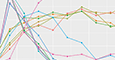
Figure 3 provides an answer. It presents results of simulation studies when the data generation process was governed by a random intensity (leading to a self-exciting Hawkes process, in technical terms). True breaks are at time points 50 and 100, shown through the broken lines in the top panel.
Figure 3. Z, ZB, R, and L estimating changes (top panel) after actual breaks while ensuring (bottom panel) non-falling long-run probabilities of picking the right number of changes (set to 2 here). The other options shown represent different choices of popular statistics that condense the amount of change between the pre- and post-change pieces. (Bhaduri. 2018).
In addition to these proposals, a host of other competitors are designed for a similar job of picking changes. The energy divergence (EDiv) option, for instance, calculates the difference in characteristic functions between the pre- and the post-change pieces, while the exponential (Exp) choice measures the disagreement between the average inter-event times over those pieces, assuming exponentially distributed arrivals. They all, in some way, keep a running record of these gaps, and propose the one that maximizes the separation as the change-point estimate (Bhaduri. 2018).
A dot on the top panel of Figure 3 represents a time that a change was signaled. Most of the competitors are sounding too many false alarms, alleging a change before the real change. Ours, on the other hand, demonstrates the clearest and the strongest right-skewed clustering after the actual changes, without too many false positives.
This experiment was conducted with a fixed sample size. One natural worry is what happens if there is a shock sequence that increases progressively in size. The bottom panel deals with that scenario. Here, the concern is not about the location of the changes, but rather the number of changes. Technically, we are checking whether the probability of detecting the right number of changes approaches one asymptotically. For most of the competitors, this probability decays quite fast. With the available choices, this probability increases predominantly; at worst, it stays stable. Therefore, if you wait sufficiently long (either in terms of clock-time, or in terms of data), you will figure out the right number of changes. You will not over-count or under-count.
What Else Can Be Done?
Our algorithm, through repeated testing, picks out dates heralding elevated shock rates. A change-detection experiment, however, transcends mere reportage. The number of days with new cases between 26,376 and 77,082 for the USA over the last month (as of this writing) was 24. Imagine trying to forecast this number using prior data. A reasonable way could be through multiplying the rate by the length of the forecast horizon, leading to (220/459) x 30 = 14.38. In contrast, if we choose to calculate the rate, not over the entire data, but only over the post-change period (beyond February 17, 2021, time point 392, Figure 1), this becomes {56/(459-392)} x 30 = 25.075, an estimate much closer to the actual.
This demonstrates how the belief typically held so dear—the larger the data set, the better it is—may scupper forecasting prospects. In such times, it is not the size of the data that matters. It’s the relevance of it. The vertical separators help us realize how much history is worth remembering and how much is worth forgetting.
The UK is among those countries that began to show early symptoms of an impending catastrophe. Its first wave began around March 31, 2020. None of the other countries tracked through Figure 1 revealed changed rates that early. A question may be raised about how different the UK’s change pattern is in relation to India’s or South Africa’s. Why not measure the distance between the two competing changepoint sets through the Euclidean metric from elementary geometry?
A valid thought, although the implementation may pose problems. There is no way to ensure these sets would be of the same size. If the UK identifies five changepoints, there is no guarantee that South Africa will do so as well. It may have only three or two. The pairwise differences that are integral to the Euclidean metric cannot be calculated. The Hausdorff metric, similar in spirit to the Euclidean, offers an alternative through

where

being the sets being compared, not necessarily of the same size. As an example, from Figure 1, India’s changepoint set is {165, 168, 215, 416, 436, 447}; the UK’s {69, 70, 235, 238, 247, 248}; and South Africa’s {147, 196, 323, 358, 486}. The Hausdorff distance between the UK and India is 199, and the one between India and South Africa is 93. Thus, the change patterns of India are more similar to South Africa than they are to the UK.
This is acceptable from Figure 1, too. Notice that the red and blue separators on India are temporally close to their counterparts for South Africa. There is no need to stop with three or four countries, though. Computational power enables calculating this metric between all possible pairs sampled in the 275 tracked countries and regions. A tree, shown in Figure 4, condenses these similarities—stereotyping countries, in a way. Those sharing smaller distances are similar in terms of their change patterns and are grouped together. Notice how, quite expectedly, India and South Africa are nearby within the red cluster, and the UK got pushed to a different gray one.
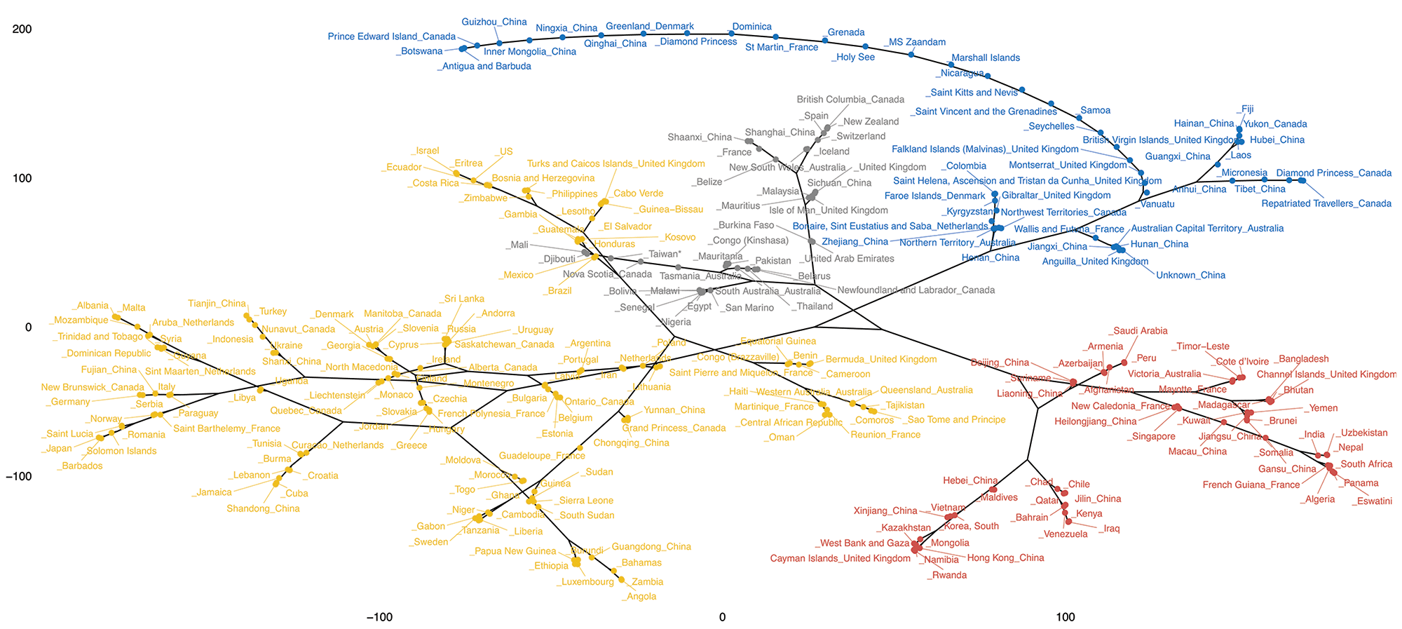
Figure 4. Countries clustered through the Hausdorff metric, shocks defined through median exceedances. Those falling in the same group exhibit similar change patterns. India, South Africa, Nepal trapped in the red block (bottom right); the UK, France, Iceland within the top half of the gray block.
Similarities exist, however, between the UK and some of its European neighbors, such as France or Iceland. Countries setting similar policies (about, say, international travel, mask-wearing, etc.) around similar times could be a probable cause.
Countries may have similar change locations, but the degree of change they endure could be rather different. How to quantify that magnitude? One way could be through measuring the difference in shock rates over the post- and pre-change phases—the rates used to forecast the U.S. situation, for instance. This would be ideal in case the process exhibits purely stationary benchmark-type tendencies over each block between adjacent change-bands. That, in the current context, is a stretch. It is more likely to see clustered shocks (leading to a “self-exciting point process”). If the median threshold gets crossed someday, it is likely to be crossed the following day, too (through an inherent autocorrelation).
A more data-dependent method, therefore, could be replacing the second wave through a bootstrapped version of the first wave (following Branu and Kulperger’s suggestion) and measuring the similarities between what we saw and what we would have seen had there been no second wave through a host of similarity indices collected in Table 1 (Hino and others. 2015). Versions may differ each time there is bootstrapping (two Indian versions are shown through the bottom panel of Figure 2), so it is important to note the median similarity. The larger these measures, the more similar the first waves are to the corresponding second waves.

Table 1—Similarities Between First and Second Waves Quantified Through Rate Differentials and Point Process-Based Similarity Indices Employed on Bootstrapped Replicates of the First Wave
Both methods indicate the UK underwent the most change. Figure 4 and Table 1, taken together, show how India and Nepal are similar both in terms of change locations and the quantity of change suffered despite, perhaps, seeing different numbers of actual infections.
Closing Thoughts
Definitions, although seemingly pesky nuisances at times, are statements that, among other aspects, anchor a debate, ensuring the objectivity of science and guaranteeing its effectiveness. They clarify the structure of the concepts being dealt with, accentuating necessary boundaries. Without these statements, without a sturdy grasp of the nature of the objects studied, serious analyses cannot commence, and even if they somehow do commence, the conclusions become open to misinterpretations.
COVID waves offer a sterling example. Policies are formed on their basis; contemporary media discuss them relentlessly and the lay public endures an incessant, soul-crushing fear of the next one. What constitutes a wave, however, remains largely subjective, venturing not beyond crude graph-gazing. This article supplies a concrete definition. That was the key aim; other benefits are welcome corollaries.
All of us, regardless of how embedded we have become in technocratic language and the necessary conditioning that statistical theories inflict upon us or endow us with, still have the capacity for tremendous awe when confronted with the simple truth that the tiny dome of our reality can be punctured at any point by other realities, by other truths. Change-detection is mainly about estimating such moments of departure. The Z– and ZB-based technique offers a way to conduct the cautious craft of finding such structural breaks, by discovering an environment where the language of change and the language of hypothesis-testing coalesce.
This puts a finger on the pulse of an evolving process. It helps in locating, within that process, episodes of shifted tendencies. It allows asking, and answering, for instance, “What is a COVID wave?” Subsequent questions may be raised at a time of deviation, probing into the cause of which that deviation is a symptom. Questions like why mask-wearing is having different effects in different regions could delve into causes that function as unexpected catalysts.
Nothing can stay insulated from change; not even change-detection approaches. A fascinating area in perpetual need of dedicated researchers.
Further Reading
Dong, E., Du, H., and Gardner, L. 2020. An interactive web-based dashboard to track COVID-19 in real time. The Lancet Infectious Diseases 20(5): 533–534.
Bhaduri, M. 2018. Bi-Directional Testing for Change Point Detection in Poisson Processes. UNLV Theses, Dissertations, Professional Papers, and Capstones. 3217.
Branu, W.J., and Kulperger, R.J. 1998. A bootstrap for point processes. Journal of Statistical Computation and Simulation 60(2): 129–155.
Hino, H., Takano, K., and Murata, N. 2015. mmpp: A package for calculating similarity and distance metrics for simple and marked temporal point processes. The R Journal 7(2): 237–248.
About the Author
Moinak Bhaduri earned his PhD in mathematical sciences from the University of Nevada Las Vegas in 2018 and is presently a tenure-line assistant professor in the Department of Mathematical Sciences at Bentley University. He studies stochastic systems that exhibit point process-type flavors and develops algorithms to locate structural shifts in their driving intensities. He is the current editor of the NextGen column of the New England Journal of Statistics in Data Science.