
COVID Monitoring Framework for Indian Cities

In early 2020, the world was gripped by the COVID-19 pandemic, and by January 2020, the World Health Organization (WHO) declared it an international pandemic. Cases kept rising in India throughout February and March 2020. Finally, in late March 2020, the Indian government declared a nationwide lockdown to contain the spread of the virus. With major uncertainty and confusion regarding the COVID-19 pandemic, there was a need for a structured framework for reporting that would provide the right set of metrics for the government and public health officials to base their health policy decisions on.
To synthesize disparate sources of information, the India Excellence Forum (IEF) and Statistics Without Borders (SWB)—nonprofit organizations that deliver meaningful community solutions—collaborated to develop a reporting platform that would aid in decision-making for various stakeholders. The goal was to leverage pre-existing infectious disease models and COVID-19–related open data to provide relevant monitoring metrics at granular levels such as states, districts, and cities.
There is an important statistical note about these metrics: Even if calculated properly and displayed properly in a dashboard, there is likely to be significant variation on a day-to-day basis. In addition to natural variation, there can be inaccurate data capture at certain geographies on certain days. Numerous statistical methods can be used for reporting on standard time-series data. Daily variation of different metrics is also temporal and subject to high variation on a day-to-day basis. This study used smoothing methods to eliminate extreme local fluctuations in the time-series data, along with similar methodologies. Statistical smoothing methods such as daily moving average (DMA) can determine the COVID-19 incidence trajectory at different geographic levels.
Early warning indicators (such as Test Positivity Rate—TPR—and other test-relating trends), active cases, and number of hospitalizations help characterize understanding the direction of growth of the virus and serve as valuable assets when managing public health infrastructure. Different visualizations and metrics would also indicate the trajectory and percentage growth of different metrics over the past few weeks. Metrics at different granular levels (state, district, and city) would help with identifying more-susceptible locations; broader geographic and administrative area-based metrics would not reveal the variation within certain parts of an area. The platform would also help stakeholders understand transmission between locations.
Metrics
What precisely does “metrics” mean? For any continuous monitoring and evaluation framework, metrics are critically important because they encapsulate pertinent information in a single value, which simplifies information processing for the end user. A well-designed metric is critical to the success of any continuous monitoring and evaluation program. This study selected metrics using existing research on infectious disease-based modeling.
Two of the main metrics in this regard are Reproduction rate (Rt) and Doubling time. Metrics such as these help decision-makers understand the transmission rate of viruses. TPR hospitalizations aid in understanding the state of public health infrastructure and efficacy of different measures.
- • Rt measures how the number of cases spreads or is changing, then provides information about changes in cases in the framework of the exponential distribution. Colloquially, Rt describes, on average, the number of people an infected person would in turn infect. When Rt is calculated to be greater than 1, cases are increasing exponentially. If Rt is less than 1, then the Rt is greater than 1. Hence, the Reproduction rate should be below 1, because this would ensure the number of cases would continue to decrease over time, and thus the spread of the virus would be contained.
- • Doubling time denotes the expected time for the number of cases to double at the current rate of growth.
Both these metrics are more important when the population at risk is naïve; that is, at the start of an epidemic. As more and more people contract the disease, the susceptible population changes, and the interpretation of these values becomes less straightforward. The dashboard for this study provides viewers with multiple metrics that, together, can aid policy decisions. Particularly for computing Rt and doubling time, the team also collaborated with another volunteer-led research group, iCART.
Methodology
Susceptible, Infected, Recovered (SIR) are generally used for infectious disease modeling. Additional factors are taken into consideration in more-complex versions of the model. A brief discussion about this method can help with understanding how reproduction rates for infectious diseases are modeled.
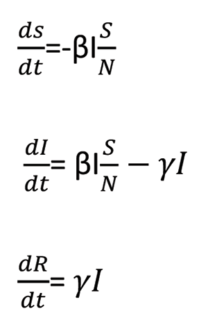
The main objective of this model is to divide the population into the three distinct SIR states. Next, estimates of how the population transitions among these states from one state to the next can compute the reproduction rate. Before delving farther, it helps to define variables associated with the SIR states:
- • N: total population
- • S(t): number of people susceptible on day t
- • I(t): number of people infected on day t
- • R(t): number of people recovered on day t (This is different from Reproduction rate Rt)
- • β: expected number of other people an infected person infects per day
- • D: number of days an infected person has and can spread the disease
- • γ: proportion of infected people recovering per day (γ = 1/D)
- • Ro: total number of people an infected person infects (Ro</sub = β / γ)
Now the transition from one state to the next—Susceptible to Infected, Infected to Recovered—can be modeled as rate × probability × population. Here, rate signifies the duration of the transition, probability represents the proportion of the population moving to the next stage, and population represents the population at a particular stage.

In the most preliminary version, the assumption is there are no incubation periods for the virus and the disease is not deadly; thus, everyone recovers. The rate of change at each stage will be equivalent to the negative of the rate of change from the previous state and thus conserving the total population in the system. In the above case, I people infect βI people, and the proportion of the total population susceptible is S/N. Thus, for all three states,
In the simple SIR model, the assumption is that there are no incubation periods for the virus and the disease is not deadly; thus, everyone recovers. In general, infectious diseases have an incubation period, where the person is exposed but not yet infected. This is also true in the case of COVID-19. The SIR model is probably too simplistic. To incorporate the incubation this, an Exposed state (denoted by E) is introduced between the S (Susceptible) and I (Infected) states. The basic idea remains the same and the model is now called SEIR.
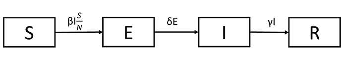
Under this SEIR model, the probability between states E and I is assumed to be 1, assuming that everyone who is exposed to the virus gets infected. A limitation of this SEIR model (and the SIR model) is that 100% of people will recover, but this does not reflect COVID-19. Still, the assumption of 100% recovery remains. Thus, the final iteration of the model introduces another state: Deceased, denoted by D, for SEIDR. The probability α denotes the fatality rate.
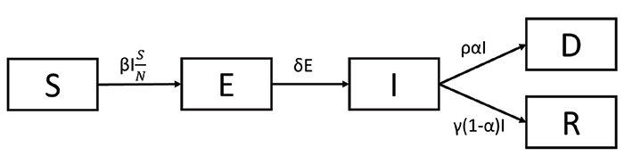
In the SEIDR model, the reproduction rate (Ro) is the proportion of β to γ. The numerator denotes the rate of infection and the denominator denotes the recovery rate. When the value of Ro is greater than 1, it suggests that the number of cases will continue to grow cumulatively. Thus, it is important to keep the Ro value below 1.
The time-dependent Rt relies on time, so Ro should not be the only metric monitored or considered. In practice, the Rt value is estimated for each population using Markov’s Chain Monte-Carlo Simulations. The uncertainties due to assumptions in the parametric distributions are also computed and included in the Rt visualization.
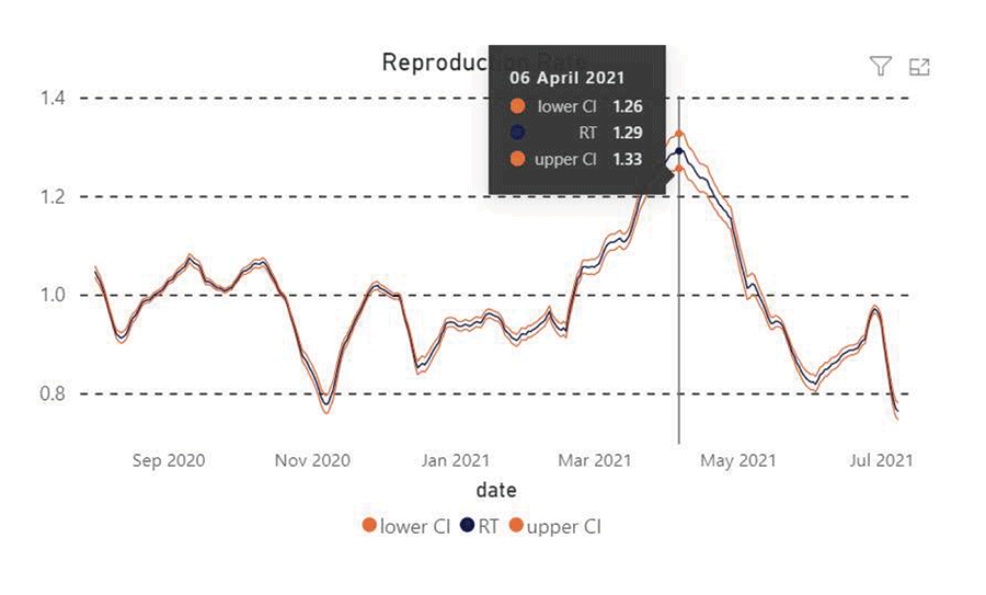
Figure 1.
Design
A few main interested parties shaped the design of the dashboard solution:
- • From the onset, the client organization intended to create a prototype solution that would be customized by city municipal authorities, based on their specific requirements.
- • The team intended to develop a solution based on established statistical methods and models in the space, which was lacking at the time.
- • Final reporting is designed to keep the end-users in mind, so device-independent design options were prioritized.
The project was completely volunteer-driven with participants around the globe. Various open-source solutions were leveraged to design, structure, and finally implement the solution. This meant the project faced multiple delays due to the lack of IT infrastructure and the dynamic nature of the teams. Moreover, the team leveraged open source software to design and implement the whole project, such as GitHub for automating workflow actions, including features for enforcing unit tests and integration tests, and enforcing mandatory code review.
At later stages, the team moved the complete project to open source cloud platforms, thus alleviating the problem of maintaining the solution in the future. The project has been completely handed over to the India Excellence Forum (IEF) team.
Results and Discussion
For each of the three Indian states with significant numbers of COVID-19, the study considered four main metrics: the number of active cases, hospitalization, daily fatalities, and tests per million.

Figure 2. Dashboard view of Maharashtra.
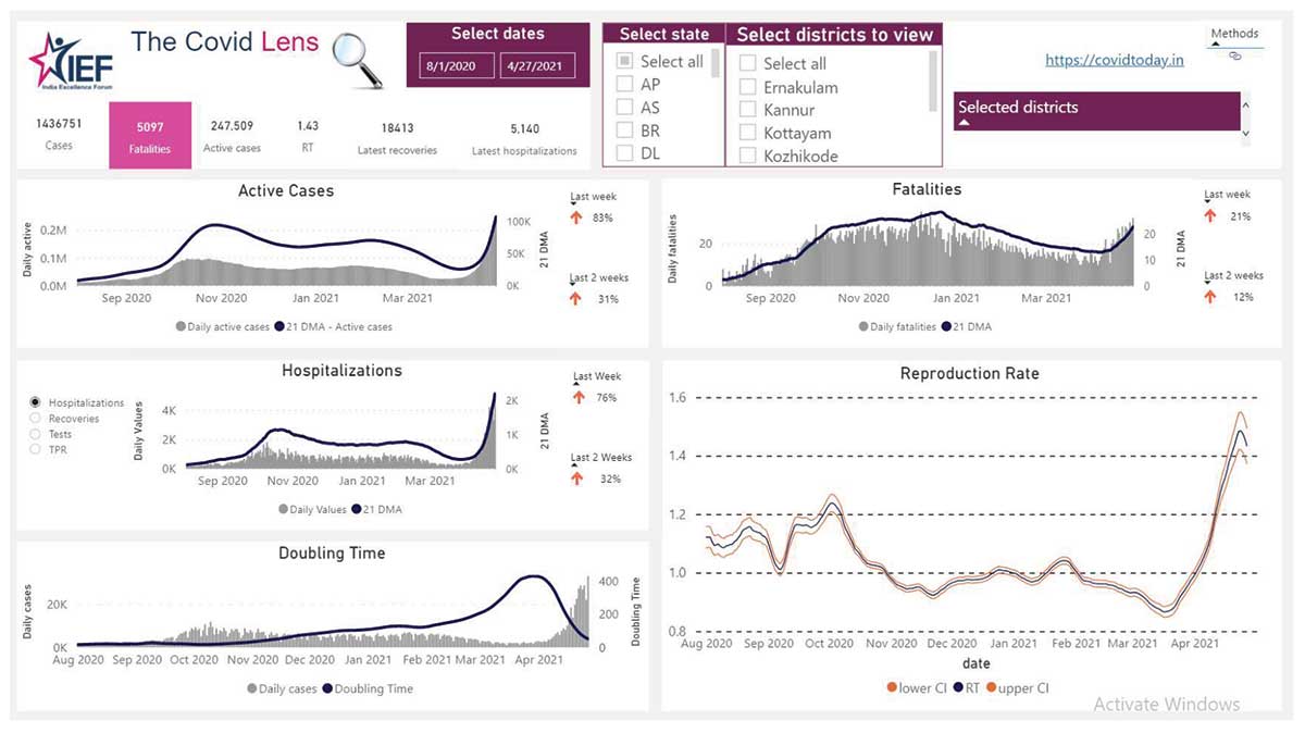
Figure 3. Dashboard view of Kerala.

Figure 4. Dashboard view of Delhi.
Maharashtra is one of the highly affected states of India. The daily cases data showed that the number of active cases reached a peak around October 2020 and were then in a declining trend. However, the number of cases has increased since the end of January 2021. Simple aggregated visualizations like this can be used to detect early indicators for hospitalizations and deaths.
In Kerala, the decline of daily active cases posted during the peak period was more gradual compared to Maharashtra, but, at the same time, a resurgence trend can be spotted at a later period. Simple exploratory analyses like these, when applied to different states, would help in identifying the strengths and weaknesses of different control measures.
Finally, for Delhi, multiple peaks in daily active cases have been observed since April 2020. Of particular note is that each time, peaks have been higher than the last time. Interestingly, in the early part of 2021, the cases dropped to an almost negligible level before peaking again in late March.
All of this information is vital to cities, states, and the nation as they consider COVID-related measures.
Conclusion
The ultimate goal of this study was to develop a solution that allows public health officials to make better decisions about how to save lives and stem the spread of COVID-19. Using this metric-based approach for monitoring data in local areas is one such solution. The team is using the SEIDR model to estimate parameters of the incidence and spread of COVID-19 more accurately, then displaying this information in a dashboard that is available to public health officials. The trends and metrics for different geographic locations ideally can be used to create benchmarks for containment mechanisms whose efficacy can also be measured in part by the dashboards described here.
Improvements to this approach would serve the intended purpose of the study. Moreover, based on end-user feedback, specific modifications can be incorporated into the dashboard, which would enhance the value proposition of this tool. Also, in the long term, the solution may need user-specific features, so customizations would be necessary to curate the solution further.
In addition to public health officials, citizens can monitor these metrics as open source information to monitor the situation in their states, districts, or cities.
One limitation of this approach is the availability of ward-level data. Currently, state and district-level data are available through government-run open source application user interfaces (APIs), but the ward-level data for each city are not available in a central repository, making the use of ward-level data limited in scope. Going forward, the availability of ward-level data from different cities in a central repository in the form of open data would greatly enhance the efficacy of this kind of open data-based project.
The trends and metrics among different geographic locations could also be used to create benchmarks for containment mechanisms. It is the team’s sincere hope that this dashboard and process be a model for other regions in need of improved infectious disease monitoring that leads to effective interventions.
Acknowledgments
The authors would like to acknowledge the contribution of the SWB volunteers in developing this solution in the form of a dashboard, and the IEF team for their continuous support during the development phase of the project.
Web link: http://thinkief.org/covid-dashboard.html
Further Reading
Cori, Anne, Neil M Ferguson, Christophe Fraser, and Simon Cauchemez. 2013. A New Framework and Software to Estimate Time-Varying Reproduction Numbers During Epidemics. American Journal of Epidemiology 178 (9). Oxford University Press: 1505–12.
Froese, Henri. 2020. Infectious Disease Modelling: Beyond the Basic SIR Model
About the Authors
Preetam Debasish Saha Roy has professional experience in the analytics function of the manufacturing, financial services, and nonprofit sectors, with an academic background in technology and business management and a research interest in data science and machine learning.
Sangeeta Jayadevan is an ex-IBMer and IBM Certified consultant with extensive experience in running large global delivery programs and driving client transformation via IT, and is volunteering with Statistics Without Borders.