
Letter to the Editor—Vol. 28, No. 1
In “A Curveball Index: Quantification of Breaking Balls for Pitchers” [Vol. 27, No. 3 of CHANCE], Jason Wilson and Jarvis Greiner give an engaging account of an experiment that began as a class project. I warmly applaud Jarvis Greiner for his imagination and initiative.
In discussing some key aspects of the statistical analysis, however, the article goes astray. Careful analysts use caution when predictions from a multiple regression may extrapolate beyond the data, but they focus on the ranges of the predictor variables rather than on the range of the response variable. The aim is to avoid extrapolation very far beyond the region of predictor space covered by the data. In practice, when the predictors are correlated, it may not suffice to look at their ranges individually. Pairwise scatterplots often help. The correlation between Total Break and Breaking Point, –0.74, suggests that these two predictors are strongly related, but the scatterplot has no points in the lower left region. Thus, predictions that involve low values of these two variables would not be supported by the data.
A more serious shortcoming is the interpretation of the coefficients in the regression:
For a given [predictor] variable, holding the other three constant, each coefficient may be interpreted as the number of points the Rating would move if the variable moved one point.
One can make predictions in this way, as long as they do not stray outside the region of predictor space supported by the data. For the effect of a predictor, however, the “held constant” interpretation of a coefficient does not reflect the way multiple regression works. (It is unfortunate that numerous textbooks use the “held constant” interpretation.) The appropriate general interpretation of the coefficient of a predictor as an effect is— according to John Tukey’s Exploratory Data Analysis—that it:
…tells us how the Y-variable responds to change in that predictor after adjusting for simultaneous linear change in the other predictors in the data at hand.
This way of stating the effect of a predictor on Y is a direct consequence of the presence of the other predictors. Because the model describes the regression of Y on the predictors jointly, the coefficient of each predictor takes into account the contributions of the other predictors; that is, it reflects the adjustment for those predictors. The wording includes “in the data at hand” because the nature of the adjustment depends on relations among the predictors in the particular set of data. As I discuss in some detail in an article to appear in The Stata Journal in 2015, the above interpretation of a regression coefficient has a straightforward mathematical derivation.
The correlation matrix for the predictors provides some information on the possibility of collinearity, and variance-inflation factors may reveal the presence of collinearity. To learn which predictors are involved and to what extent, however, one must go further—for example, by using the regression-coefficient variance decomposition discussed in Regression Diagnostics: Identifying Influential Data and Sources of Collinearity. The model containing the predictors Rise, Breaking Point, Knee Distance, and Total Break, and no intercept term, has no problem with collinearity; the largest “condition index” is only 7.1. When the predictors include the intercept, the largest condition index—30.3—signals a problem (though not a severe one), and three predictors are involved: Breaking Point, Total Break, and the constant.
Three points in the box on Page 36 would benefit from clarification. First, as Wilson and Greiner emphasize, a scatterplot of Y versus X should be the first step in examining the relation between Y and X. It may then not be necessary to obtain the correlation between Y and X. They go astray, however, when they say:
If the correlation is significant, then the shape on the scatterplot will have a linear trend and a simple linear regression line may be fit to the data.
The correlation coefficient does measure strength of linear relation—but only when X and Y have a linear relation. Almost any set of (x,y) data will have a value of the correlation coefficient, even when the relation is far from linear. This is why the scatterplot is so important. F.J. Anscombe, in “Graphs in Statistical Analysis,” carefully constructed four sets of (x,y) data that have exactly the same regression summary statistics; it would be appropriate to fit a regression line for only one of them. For the data on curveballs, the scatterplot of Knee Distance (Location) versus Total Break (Figure 1) shows a roughly V-shaped pattern. The correlation is –0.45, but the pattern is not linear. A closer look reveals that data from pitcher A and pitcher B (and one point from pitcher C) make up the left half of the V. Similarly, the scatterplot of Rating versus Breaking Point (Figure 2) suggests that the relation between these two variables may differ among the three pitchers.
Second, many statisticians would not agree with the statement that “the observations are independent.” The data consist of three clusters: the observations on ten pitches of each of three pitchers. Having a pitcher in common introduces correlation among the observations within a subset of 10. Though the data may show little evidence of that correlation, many analysts would consider a mixed linear model with a random effect for pitchers—especially in a larger dataset involving more pitchers, where interest may shift from the effects of individual pitchers to variation in a population of pitchers.
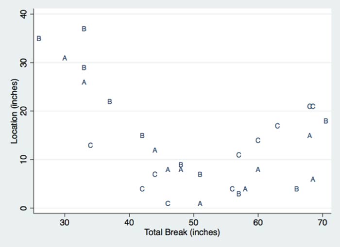
Figure 1. Scatterplot of Knee Distance (Location) versus Total Break. The plotting symbol denotes the pitcher.

Figure 2. Scatterplot of Rating versus Breaking Point. The plotting symbol denotes the pitcher.
Third, the test for normality is the Shapiro-Wilk test, not the Shapiro-Wilks test. The second author was Martin B. Wilk.
David C. Hoaglin
Independent Consultant
Sudbury, Massachusetts
Further Reading
Anscombe, F. J. 1973. Graphs in statistical analysis. The American Statistician 27.1:17–21.
Belsley, David A., Edwin Kuh, and Roy E. Welsch. 1980. Regression diagnostics: Identifying influential data and sources of collinearity. New York: John Wiley & Sons.
Hoaglin, David C. 2015. Regressions are commonly misinterpreted. The Stata Journal.
Tukey, John W. 1970. Exploratory data analysis, limited preliminary edition, Volume 2. Reading, MA: Addison-Wesley.