
Setting the Stage for Data Science: Integration of Data Management Skills in Introductory and Second Courses in Statistics

Many have argued that statistics students need additional facility to express statistical computations. By introducing students to commonplace tools for data management, visualization, and reproducible analysis in data science, and applying these to real-world scenarios, we prepare them to think statistically. In an era of increasingly big data, it is imperative that students develop data-related capacities, beginning with the introductory course. We believe that the integration of these precursors to data science into our curricula—early and often—will help statisticians be part of the dialogue regarding Big Data and Big Questions.
Specifically, through our shared experience working in industry, government, private consulting, and academia, we have identified five key elements that deserve greater emphasis in the undergraduate curriculum (in no particular order):
- Thinking creatively, but constructively, about data. This “data tidying” includes the ability to move data not only between different file formats, but also into different shapes. There are elements of data-storage design (e.g., normal forms) that students need to learn, along with an understanding about how data should be arranged based on how it will likely be used.
- Facility with data sets of varying sizes, and some understanding of scalability issues when working with data. This includes an elementary understanding of basic computer architecture (e.g., memory vs. hard disk space), and the ability to query a relational database management system (RDBMS).
- Statistical computing skills in a command-driven environment (e.g., R, Python, or Julia). Coding skills (in any language) are highly valued and increasingly necessary. They provide freedom from the un-reproducible point-and-click application paradigm.
- Experience wrestling with large, messy, complex, challenging data sets, for which there is no obvious goal or specially curated statistical method (see What’s in a Word). While perhaps sub-optimal for teaching specific statistical methods, these data are more similar to what analysts actually see in the wild.
- An ethos of reproducibility. This is a major challenge for science in general, and we have the comparatively easy task of simply reproducing computations and analysis.
We illustrate below how these five elements can be addressed in the undergraduate curriculum. To this end, we’ll be exploring questions related to airline travel using a large data set that is by necessity housed in a relational database (see Databases). We present R code using the dplyr framework—and moreover, this paper itself—in the reproducible R Markdown format. Statistical educators play a key role in helping to prepare the next generation of statisticians and data scientists. We hope that this exercise will assist them in narrowing the aforementioned skills gap.
A Framework for Data-Related Skills
The statistical data analysis cycle involves the formulation of questions, collection of data, analysis, and interpretation of results (see Figure 1). Data preparation and manipulation are not just first steps, but key components of this cycle (which will often be nonlinear, see also “Tidy Data”). When working with data, analysts must first determine what is needed, describe this solution in terms that a computer can understand, and execute the code.

Figure 1. Statistical data analysis cycle
(Source: http://bit.ly/bigrdata4)
Here we illustrate how the dplyr package in R can be used to build a powerful and broadly accessible foundation for data manipulation. This approach is attractive because it provides simple functions that correspond to the most common data-manipulation operations (or verbs) and uses efficient storage approaches so that the analyst can focus on the analysis. (Other systems could certainly be used in this manner, see example.)
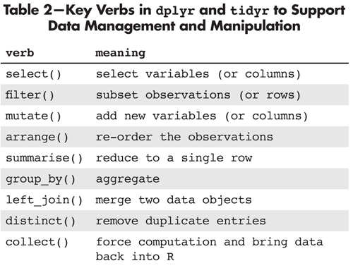
Table 2—Key Verbs in dplyr and tidyr to Support Data Management and Manipulation
Airline Delays
To illustrate these data-manipulation verbs in action, we consider analysis of airline delays in the United States. This data set, constructed from information made available by the Bureau of Transportation Statistics, was utilized in the ASA Data Expo 2009 (see Wickham’s paper in the Journal of Computational and Graphical Statistics). This rich data repository contains more than 150 million observations corresponding to each commercial airline flight in the United States between 1987 and 2012. (The magnitude of this data set precludes loading it directly in R, or most other general purpose statistical packages.)
We demonstrate how to undertake analysis using the tools in the dplyr package. (A smaller data set is available for New York City flights in 2013 within the nycflights13 package. The interface in R is almost identical in terms of the dplyr functionality, with the same functions being used.)
Students can use this data set to address questions that they find real and relevant. (It is not hard to find motivation for investigating patterns of flight delays. Ask students: Have you ever been stuck in an airport because your flight was delayed or canceled, and wondered if you could have predicted the delay if you’d had more data?)
We begin by loading needed packages and connecting to a database containing the flight, airline, airport, and airplane data (see Databases).
require(dplyr); require(mosaic); require(lubridate)
# login credentials in ~/.my.cnf
my_db <- src_mysql(host=“DBname.com”, user=NULL, password=NULL, dbname=“airlines”)
This example uses data from a database with multiple tables (collection of related data).
ontime <- tbl(my_db, “ontime”)
airports <- tbl(my_db, “airports”)
carriers <- tbl(my_db, “carriers”)
planes <- tbl(my_db, “planes”)
Filtering Observations
We start with an analysis focused on three smaller airports in the Northeast. This illustrates the use of filter(), which allows the specification of a subset of rows of interest in the airports table (or data set). We first start by exploring the airports table. Suppose we wanted to find out which airports certain codes belong to?
filter(airports, code %in% c(‘ALB’, ‘BDL’, ‘BTV’))
## From: airports [3 x 7]
## Filter: code %in% c(“ALB”, “BDL”, “BTV”)
##
## code name city state country
## ALB Albany Cty Albany NY USA
## BDL Bradley Intl. Windsor Locks CT USA
## BTV Burlington Intl. Burlington VT USA
## Variables not shown: latitude longitude
Aggregating Observations
Next we aggregate the counts of flights at all three of these airports at the monthly level (in the ontime flight-level table), using the group_by() and summarise() functions. The collect() function forces the evaluation. These functions are connected using the %>% operator. This pipes the results from one object or function as input to the next in an efficient manner.
airportcounts %
filter(Dest %in% c(‘ALB’, ‘BDL’, ‘BTV’)) %>%
group_by(Year, Month, Dest) %>%
summarise(count = n()) %>%
collect()
Creating New Derived Variables
Next we add a new column by constructing a date variable (using mutate() and helper functions from the lubridate package), then generate a time-series plot.
airportcounts %
mutate(Date = ymd(paste(Year, “-“, Month, “-01”, sep=“”)))
head(airportcounts) # list only the first six observations
## Source: local data frame [6 x 5]
## Groups: Year, Month
##
## Year Month Dest count Date
## 1 1987 10 ALB 957 1987-10-01
## 2 1987 10 BDL 2580 1987-10-01
## 3 1987 10 BTV 549 1987-10-01
## 4 1987 11 ALB 950 1987-11-01
## 5 1987 11 BDL 2442 1987-11-01
## 6 1987 11 BTV 496 1987-11-01
xyplot(count ~ Date, groups=Dest, type=c(“p”,”l”), lwd=2, auto.key=list(columns=3), ylab=“Number of flights per month”, xlab=“Year”, data=airportcounts)
We observe in Figure 2 that there are some interesting patterns over time for these airports. Bradley (serving Hartford, CT and Springfield, MA) has the largest monthly volumes, with Burlington the fewest flights. At all three airports, there has been a decline in the number of flights from 2005 to 2012.

Figure 2. Comparison of the number of flights arriving at three airports over time
Sorting and Selecting
Another important verb is arrange(), which in conjunction with head() lets us display the months with the largest number of flights. Here we need to use ungroup(), since otherwise the data would remain aggregated by year, month, and destination.
airportcounts %>%
ungroup() %>%
arrange(desc(count)) %>%
select(count, Year, Month, Dest) %>%
head()
## Source: local data frame [6 x 4]
##
## count Year Month Dest
## 1 3318 2001 8 BDL
## 2 3299 2005 3 BDL
## 3 3289 2001 7 BDL
## 4 3279 2001 5 BDL
## 5 3242 2005 8 BDL
## 6 3219 2005 5 BDL
We can compare flight delays between two airlines serving a city pair. For example, which airline was most reliable flying from Chicago O’Hare (ORD) to Minneapolis/St. Paul (MSP) in January 2012? Here we demonstrate how to calculate an average delay for each day for United, Delta, and American (operated by Envoy/American Eagle). We create the analytic data set through use of select() (to pick the variables to be included), filter() (to select a tiny subset of the observations), and then repeat the previous aggregation. (Note that we do not address flight cancellations: this exercise is left to the reader, or see the Online Examples.)
delays %
select(Origin, Dest, Year, Month,DayofMonth, UniqueCarrier, ArrDelay) %>%
filter(Origin == ‘ORD’ & Dest == ‘MSP’ & Year == 2012 & Month == 1 & (UniqueCarrier %in% c(“UA”, “MQ”, “DL”))) %>%
group_by(Year, Month, DayofMonth,UniqueCarrier) %>%
summarise(count = n(), meandelay = mean(ArrDelay))%>%
collect()
Merging
Merging is another key capacity for students to master. Here, the full carrier names are merged (or joined, in database parlance) to facilitate the comparison, using the left_join() function to provide a less terse full name for the airlines in the legend of the figure.
carriernames %
filter(code %in% c(“UA”, “MQ”, “DL”)) %>%
collect()
merged <- left_join(delays, carriernames, by=c(“UniqueCarrier” = “code”))
head(merged)
## Source: local data frame [4 x 6]
## Groups: Year, Month, DayofMonth
##
## Year Month DayofMonth
## UniqueCarrier meandelay
## 2012 1 13 MQ 78.33
## 2012 1 20 UA 59.25
## 2012 1 21 MQ 88.40
## 2012 1 22 MQ 53.80
## Variables not shown: count
densityplot(~ meandelay, group=name, auto.key=TRUE, data=merged)
We see in Figure 3 that the airlines are fairly reliable, though there were some days with average delays of 50 minutes or more (three of which were accounted for by Envoy/American Eagle).
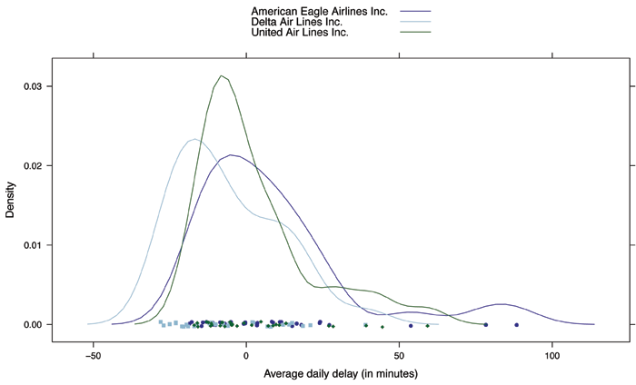
Figure 3. Comparison of mean flight delays from O’Hare to Minneapolis/St. Paul in January 2012 for three airlines
filter(delays, meandelay > 50)
## Source: local data frame [4 x 6]
## Groups: Year, Month, DayofMonth
##
## Year Month DayofMonth
## UniqueCarrier meandelay
## 2012 1 13 MQ 78.33
## 2012 1 20 UA 59.25
## 2012 1 21 MQ 88.40
## 2012 1 22 MQ 53.80
## Variables not shown: count
Finally, we can drill down to explore all flights on Mondays in the year 2001.
flights %
filter(DayofWeek==1 & Year==2001) %>%
group_by(Year, Month, DayOfMonth) %>%
summarise(count = n()) %>%
collect()
flights <- mutate(flights, Date=ymd(paste (Year, “-“, Month, “-“, DayOfMonth, sep=“”)))
xyplot(count ~ Date, type=“l”, ylab=“Count of flights on Mondays”, data=flights)
ladd(panel.abline(v=ymd(“2001-09-11”), lty=2))
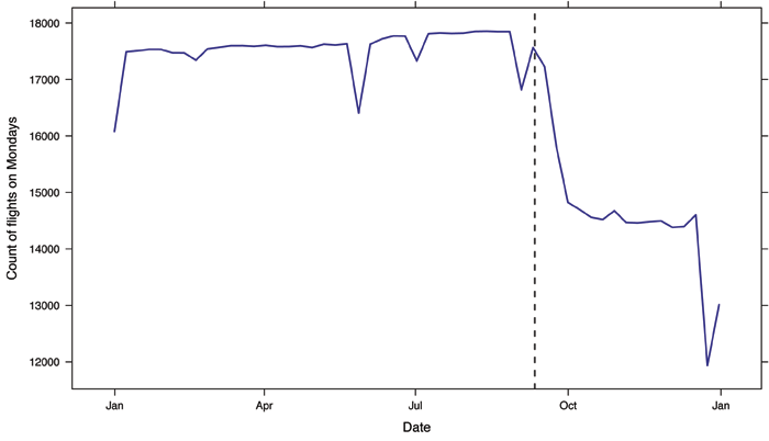
Figure 4. Display of counts of commercial flights on Mondays in the United States in 2001. The clear impact of 9/11 can be seen.
Integrating Bigger Questions and Data Sets into the Curriculum
This opportunity to make a complex and interesting data set accessible to students in introductory statistics is quite compelling. In the introductory (or first) statistics course, we explored airline delays without any technology through use of the “Judging Airlines” model eliciting activity (MEA) developed by the CATALST Group. This MEA guides students to develop ideas regarding center and variability and the basics of informal inferences using small samples of data for pairs of airlines flying out of Chicago.
Figure 5 displays sample airline delays for 10 flights each for American Eagle Airlines and Mesa Airlines flying from Chicago to Green Bay, WI. As part of this activity, students need to describe five possible sample statistics which could be used to compare the flight delays by airline. These might include the average, the maximum, the median, the 90th percentile, or the fraction that are late. Finally, they need to create a rule that incorporates at least two of those summary statistics that can be used to make a decision about whether one airline is more reliable. A possible rule might be to declare an airline is better than another if that airline has half an hour less average delay, and that same airline has 10% fewer delayed flights than the other. (If the two measures of reliability differ in direction for the two airlines, no call is made.)
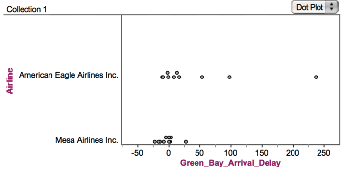
Figure 5. Fathom software display of sample airline delays data for a city pair used in the “Judging Airlines” MEA (model eliciting activity).
To finish the assignment, students are provided with data for another four city pairs, asked to carry out their rule on these new “test” data sets, and then told to summarize their results in a letter to the editor of Chicago Magazine.
Later in the course, the larger data set can be reintroduced in several ways. It can be brought into class to illustrate univariate summaries or bivariate relationships (including more sophisticated visualization and graphical displays). Students can pose questions through projects or other extended assignments. A lab activity could have students explore their favorite airport or city pair (when comparing two airlines they will often find that only one airline services that connection, particularly for smaller airports). Students could be asked to return to the informal “rule” they developed in an extension to assess its performance. Their rule can be programmed in R, and then carried out on a series of random samples from the flights from that city on that airline within that year. This allows them to see how often their rule picked an airline as being more reliable (using various subsets of the observed data as the “truth”). Finally, students can summarize the population of all flights as a way to better understand sampling variability. This process reflects the process followed by analysts working with big data: Sampling is used to generate hypotheses that are then tested against the complete data set.
In a second course, more time is available to develop diverse statistical and computational skills. This includes more sophisticated data management and manipulation, with explicit learning outcomes that are a central part of the course syllabus.
Other data wrangling and manipulation capacities can be introduced and developed using this example, including more elaborate data joins/merges (since there are tables providing additional (meta)data about planes). As an example, consider the many flights of plane N355NB, which flew out of Bradley airport in January 2008.
filter(planes, tailnum==“N355NB”)
## From: planes [1 x 10]
## Filter: tailnum == "N355NB"
##
## tailnum type manufacturer issue_date model status
## 1 N355NB Corporation AIRBUS 11/14/2002 A319-114 Valid
## Variables not shown: aircraft_type (chr), engine_type (chr), year (int),
## issueDate (chr)
We see that this is an Airbus 319.
singleplane <- filter(ontime, tailnum==“N355NB”) %>%
select(Year, Month, DayofMonth, Dest, Origin, Distance) %>%
collect()
singleplane %>%
group_by(Year) %>%
summarise(count = n(), totaldist = sum(Distance))
## Source: local data frame [13 x 3]
##
## Year count totaldist
## 1 2002 152 136506
## 2 2003 1367 1224746
## 3 2004 1299 1144288
## 4 2005 1366 1149142
## 5 2006 1484 1149036
## 6 2007 1282 1010146
## 7 2008 1318 1095109
## 8 2009 1235 1094532
## 9 2010 1368 1143189
## 10 2011 1406 919893
## 11 2012 1213 807246
## 12 2013 1339 921673
## 13 2014 169 97257
sum(~ Distance, data=singleplane)
## [1] 11892763
This Airbus A319 has been very active, with around 1,300 flights per year since it came online in late 2002, and it has amassed more than 11 million miles in the air.
singleplane %>%
group_by(Dest) %>%
summarise(count = n()) %>%
arrange(desc(count)) %>%
filter(count > 500)
## Source: local data frame [5 x 2]
##
## Dest count
## 1 MSP 2861
## 2 DTW 2271
## 3 MEM 847
## 4 LGA 812
## 5 ATL 716
Finally, we see that it tends to spend much of its time flying to Minneapolis/St. Paul (MSP) and Detroit (DTW).
Mapping
Mapping is also possible, since the latitude and longitude of the airports are provided. Figure 6 displays a map of flights from Bradley airport in 2013 (the code to create the display can be found with the online examples).
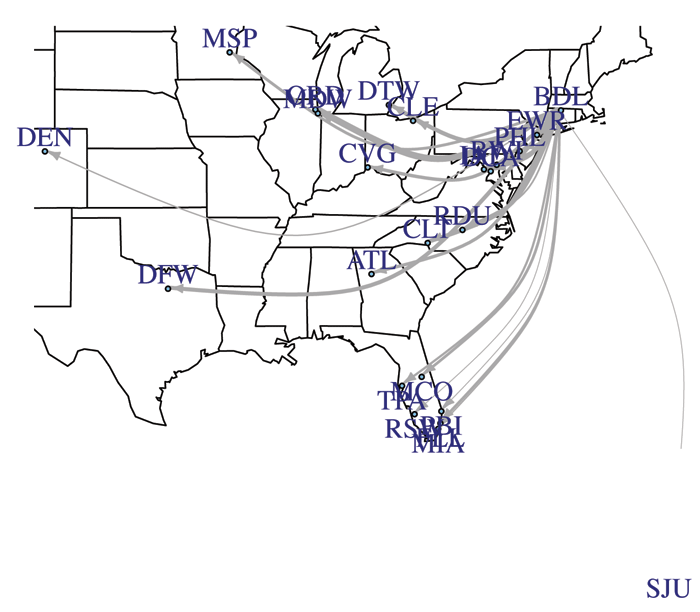
Figure 6. Map of flights from Bradley airport in 2013
Linkage to other data scraped from the Internet (e.g., detailed weather information for a particular airport or details about individual planes) may allow other questions to be answered (this has already been included in the nycflights13 package; see Databases). Use of this rich data set helps to excite students about the power of statistics, introduce tools that can help energize the next generation of data scientists, and build useful data-related skills.
Conclusion and Next Steps
Statistics students need to develop the capacity to make sense of the staggering amount of information collected in our increasingly data-centered world. In the 2013 book Doing Data Science, co-written by Rachel Schutt and Cathy O’Neil, Schutt succinctly summarized the challenges she faced as she moved into the workforce: “It was clear to me pretty quickly that the stuff I was working on at Google was different than anything I had learned at school.” This anecdotal evidence is corroborated by the widely cited McKinsey Global Institute report that called for the training of hundreds of thousands of workers with the skills to make sense of the rich and sophisticated data now available to make decisions (along with millions of new managers with the ability to comprehend these results). The disconnect between the complex analyses now demanded in industry and the instruction available in academia is a major challenge for the profession.
We agree that there are barriers and time costs to the introduction of reproducible analysis tools and more sophisticated data-management and -manipulation skills to our courses. Further guidance and research results are needed to guide our work in this area, along with illustrated examples, case studies, and faculty development. But these impediments must not slow down our adoption. As Schutt cautions in her book, statistics could be viewed as obsolete if this challenge is not embraced. We believe that the time to move forward in this manner is now, and believe that these basic data-related skills provide a foundation for such efforts.
Copies of the R Markdown and formatted files for these analyses (to allow replication of the analyses) along with further background on databases and the Airline Delays data set are available here. A previous version of this paper was presented in July, 2014 at the International Conference on Teaching Statistics (ICOTS9) in Flagstaff, AZ.
Further Reading
American Statistical Association Undergraduate Guidelines Workgroup. 2014. 2014 Curriculum guidelines for undergraduate programs in statistical science. American Statistical Association.
Baumer, B. S., M. Cetinkaya-Rundel, A. Bray, L. Loi, and N.J. Horton. 2014. R Markdown: Integrating a reproducible analysis tool into introductory statistics. Technology Innovations in Statistics Education.
Finzer, W. 2013. The data science education dilemma. Technology Innovations in Statistics Education.
Horton, N.J., B. S. Baumer, and H. Wickham. 2014. Teaching precursors to data science in introductory and second courses in statistics.
Nolan, D., and D. Temple Lang. 2010. Computing in the statistics curricula, The American Statistician 64:97–107.
O’Neil, C., and R. Schutt. 2013. Doing Data Science: Straight Talk from the Frontline. O’Reilly and Associates.
Wickham, H. 2011. ASA 2009 Data Expo. Journal of Computational and Graphical Statistics 20(2):281-283.
About the Authors
Nicholas J. Horton is a professor of statistics at Amherst College, with interests in longitudinal regression, missing data methods, statistical computing, and statistical education. He received his doctorate in biostatistics from the Harvard School of Public Health in 1999, and has co-authored a series of books on statistical computing in R and SAS. He is an accredited statistician, a fellow of the American Statistical Association, former member of the ASA board of directors, and chair-elect of the ASA’s section on statistical education.
Ben S. Baumer is an assistant professor in the program in statistical and data sciences at Smith College, and currently serves as the program’s director. He spent nine seasons as the New York Mets’ statistical analyst for baseball operations, where he developed the front office’s statistical infrastructure. He received his PhD in mathematics from the City University of New York, and is an accredited statistician (PStat). He is a co-author, with Andrew Zimbalist, of The Sabermetric Revolution: Assessing the Growth of Analytics in Baseball.
Hadley Wickham is chief scientist at RStudio and adjunct professor of statistics at Rice University. He is interested in building better tools for data science. His work includes R packages for data analysis (ggvis, dplyr, tidyr); packages that make R less frustrating (lubridate for dates, stringr for strings, httr for accessing web APIs, rvest for webscraping); and that make it easier to do good software development in R (roxygen2, testthat, devtools). He is also a writer, educator, and frequent speaker promoting more accessible, more effective, and more fun data analysis.

In Taking a Chance in the Classroom, column editors Dalene Stangl and Mine Çetinkaya-Rundel focus on pedagogical approaches to communicating the fundamental ideas of statistical thinking in a classroom using data sets from CHANCE and elsewhere.