Can You Buy a President? Politics After the Tillman Act
A Political Action Committee (PAC) is defined as any organization that seeks to influence the outcome of an election or policy decision through financial donations. Until recently, there have been strict regulations in place limiting the amount of money individuals and corporations can donate to PACs.
In 2010, the United States Supreme Court released its decision on Citizens United v. Federal Election Commission. The decision found it is a violation of the constitutional right to free speech for limits to be placed on money spent by corporations and labor unions to support or oppose political candidates. For the first time since the passage of the Tillman Act of 1907, corporations and unions could spend unlimited amounts of their own money on the presidential election. Such power led to the term “super PAC,” as well as a cloud of uncertainty as to what effect such money could have on the election outcome. Three of the largest super PACs—American Crossroads, Restore Our Future, and Priorities USA Action—spent more than $305 million combined in the 2012 election cycle alone. According to the 2008 Independent Expenditure Summaries released by the Federal Election Committee, PACs spent more than $151 million on the presidential election (not including primaries) in 2008, or approximately $0.50 per U.S. citizen. In 2012, PACs and super PACs spent more than $560 million, or approximately $1.78 per U.S. citizen. With this 350% increase in spending, the fear is that a small group of extremely wealthy individuals or corporations can buy a president.
In this report, we analyze independent expenditures filings from the Federal Election Commission in an attempt to determine the effect of this spending on the 2012 election. We subset these expenditures to analyze only those that were filed after the Republican primary so we can focus on those that benefit President Barack Obama and Gov. Mitt Romney. We also retrieve data from the NationalPolls.com database of polling results to quantify the effect of this spending. The results of our analysis suggest that the spending may have had a measurable impact on public opinion, but external factors, such as the presidential debates, had much stronger impacts.
Data
We are primarily working with two data sources to complete our analysis: independent expenditures data and polling data. The Federal Election Commission (FEC) keeps track of the spending by independent organizations and makes the information publicly available. Note that this data includes organizations not considered to be super PACs—including the Republican and Democratic National Committees—and smaller PACs. We will henceforth reference these organizations simply as super PACs for simplicity.
The polling data comes from NationalPolls.com, a website that aggregated national and state polls from multiple polling companies. We are primarily working with the independent organization names, expense amounts, date of filed expense, and purpose of the expense from the spending data. These provide us with information about the organization filing the expense and the amount, date, and purpose of the expense. We also make extensive use of our created field that indicates which candidate benefited from the expense. A description of the fields used most in the spending data set is provided in Table 1, and a description of the fields used in the polling data set is provided in Table 2. A full description of all fields available from the FEC and NationalPolls.com is available in our supplemental materials.
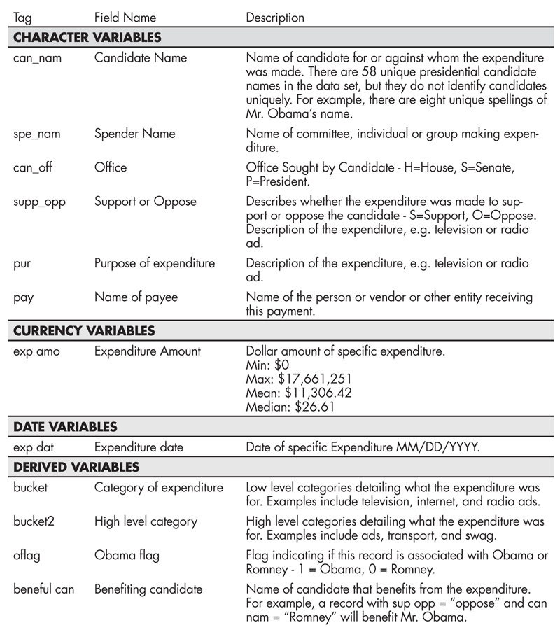
Table 1—Description of Spending Data Fields
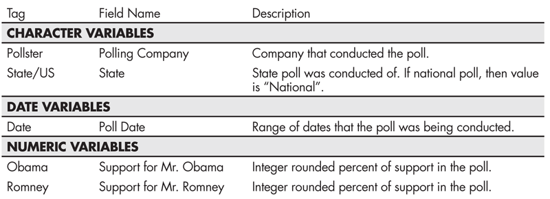
Table 2—Description of Polling Data Fields
We had to spend a significant amount of time cleaning the super PAC spending data to make it usable for analysis. We used pattern recognition and text manipulation methods to accomplish the cleaning. Even seemingly simple analyses like counting the number of expenditures benefiting each candidate were made more complicated by the reality of the data. Complications arose from multiple issues, the first being the lack of standardization in the candidate name field (can nam). For example, Obama’s name was misspelled eight ways and Romney’s name was misspelled seven ways. See Table 3 for details.
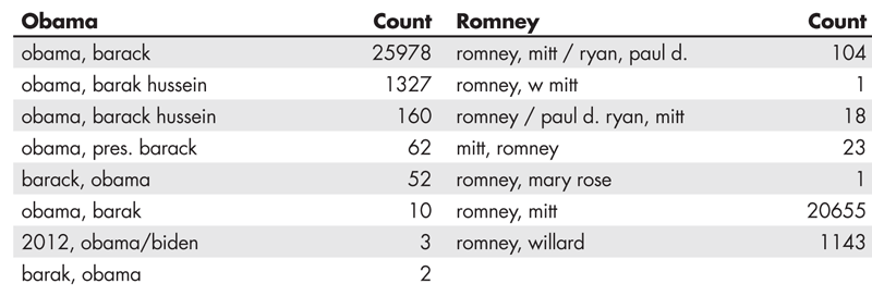
Table 3—Number of Occurrences of Candidate Name Spellings in Spending Data
An additional complication we faced was with the support/oppose column (sup opp). This column in conjunction with the candidate column (can nam) is used to indicate which candidate benefits from the expenditure. An example would be if the support/oppose value is “oppose” and the candidate name is “Romney,” then Obama benefits because the money is being spent to “oppose Romney.” Likewise, if the support/oppose column equals “support” and the candidate name is “Romney,” then Romney benefits. We solved this by adding a new field that simply stores the candidate who benefits from the particular expense. However, 12 super PACs appeared to support both candidates (see Table 4). After researching these super PACs, we found they were not, in fact, bipartisan supporters and concluded an entry error had been made on those filings. We coded those records to indicate support of the candidate who most often benefited from those super PACs.
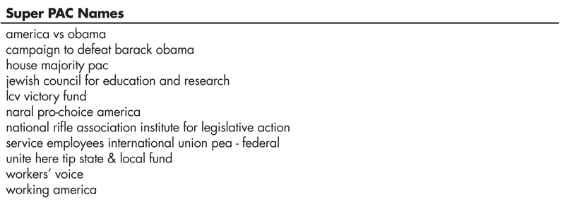
Table 4—Super PACs Appearing to Support Both Candidates
Another serious challenge we faced was that the purpose of independent expenditures column is a free text field on the FEC reporting form. This left us with 1,466 unique entries. For example, the conservative super PAC Americans for Prosperity tended to use verbose descriptions of the spending purpose. An entry from mid-August read “oppose advertising-tv production (voted for).” This description lists whether it was an ad in support or opposition, that it was a television ad, and the name of the ad. In contrast, the anti-abortion Women Speak Out PAC preferred short descriptions, such as “ads” for their early-October expense. The result was that when trying to explore what super PACs spent the majority of their money on, we were unable to group expenditures. To solve this issue, we searched for matches to patterns in the purpose field. We chose these patterns by looking at the expenditure purposes and manually identifying common threads among the purposes. From these patterns, we were able to create “buckets” that each expense fell into, as well as high-level buckets that more generally classified the expenditures. The buckets we chose were the following:
- Ads—Advertisement spending, including television, radio, and online
- Direct Contact—Direct voter contact, such as canvassing
- Overhead—Expenditures related to the ongoing cost of running a super PAC, including salary, rent, consultants, fundraising, and travel
- Swag—Clothing, signs, and other promotional material
- Other—All expenses that do not fit into the above buckets
Both of the example records above have a high-level classification (bucket 2) of “ad,” while they have a low-level classification (bucket) of “tv” and “media,” respectively.
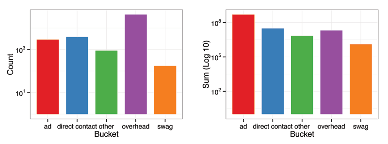
Figure 1. Number of expenditures filings and total amount spent (log 10) by high-level bucket (bucket 2)
The polling data did not require much data clean up. We split the date range and formatted the end date as a date for our use. We also removed differences in state naming by the different pollsters. One limitation we faced is that a fairly significant number of polls were excluded from the NationalPolls.com database. Some new national polling outfits, such as the RAND Corporation, were excluded, as were a large number of online polls, including Google Consumer Surveys.
Online surveys showed better predictive performance in the 2012 election than did automated phone surveys or live interviewer surveys, according to New York Times columnist Nate Silver in a blog post titled “Which Polls Fared Best (and Worst) in the 2012 Presidential Race.” Polling aggregators may want to examine the performance of new survey techniques more closely and consider including them in future elections.
Who Are the Big Spenders?
Figure 2 displays the total spending by the top super PACs split by candidate. The cumulative amounts spent are displayed vertically, by the benefiting candidate. The organizations supporting Romney spent significantly more than those supporting Obama. In fact, two super PACs supporting Romney (Restore Our Future, Inc. and American Crossroads) together have spent more than all the organizations supporting Obama combined.
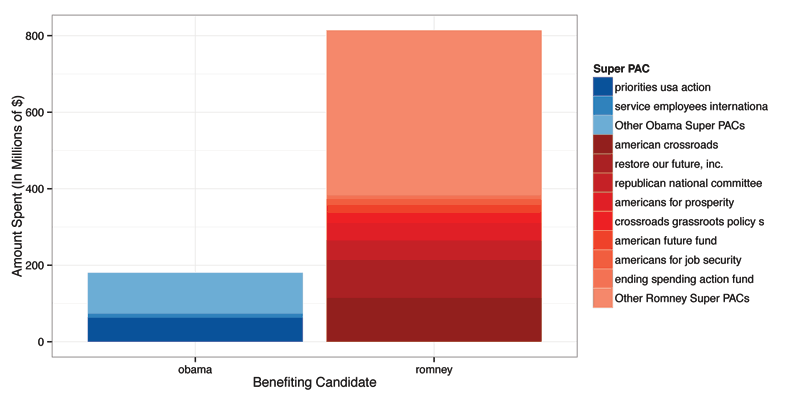
Figure 2. Spending by super PAC, stacked by candidate
It can be seen that certain super PACs have accounted for the bulk of all spending. For those benefiting Obama, Priorities USA Action accounted for about 35% of the total spending. Meanwhile, Restore Our Future, Inc. and American Crossroads combined spent about 25% of the total spending on Romney. This suggests that super PACs are clearly an unprecedented entity in terms of their monetary influence on the election. All super PACs in total spent nearly $1 billion during the course of the election campaign. With a total of just under 127 million votes cast in the election, this equates to nearly $8 spent per vote.
Swing States
Figure 3 highlights 12 states with particularly even polling results. We will refer to these as swing states. Figure 4 displays the change in polling support for both Romney and Obama over time in these swing states.
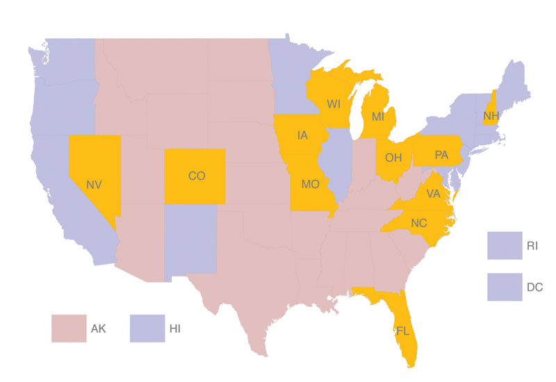
Figure 3. Map of United States with swing states highlighted in yellow. States won by the Republican candidate, John McCain, in 2008 election are highlighted in red, while states won by Obama in 2008 are highlighted in blue.
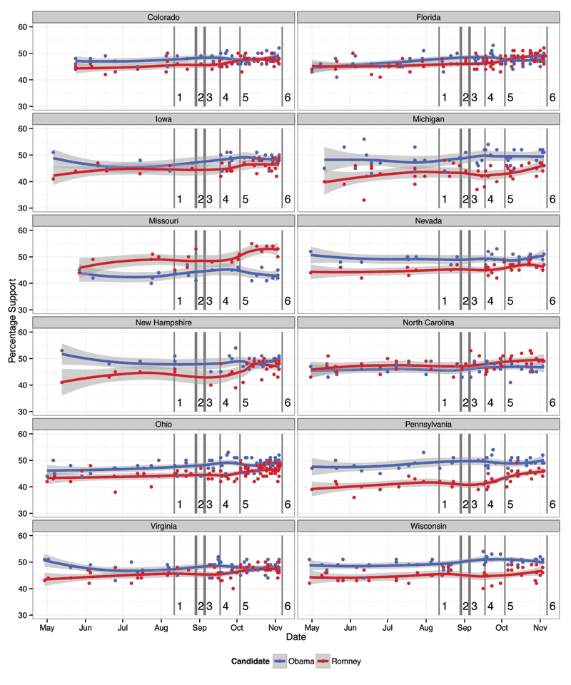
Figure 4. Polling averages for Obama and Romney by swing state. Important events are indicated as follows: (1) Paul Ryan VP selection, (2) Republican National Convention, (3) Democratic National Convention, (4) 47% video leaked, (5) first presidential debate, and (6) Election Day. The overall trends in polling are shown using a loess smoother. The gray bands surrounding the curves are confidence bands representing plausible values of percentage support for each candidate.
The data include all polls in the NationalPolls.com database from April 25 to November 6. Percent support for each candidate is shown for each state with a smoothed line indicating trend. There are six markers that signify major events in the campaign: Paul Ryan’s selection as vice presidential nominee, the Republican National Convention, the Democratic National Convention, the original leak of the 47% video (in which Romney was recorded delivering controversial comments regarding government dependency), the first presidential debate, and Election Day.
Figure 4 uses a loess smoother to show an overall trend in Obama and Romney’s polling. Loess smoothing fits simple trend lines to small subsets of the data set to produce a smooth curve through the data points. The gray bands surrounding the curves are confidence bands representing plausible values of percentage support for each candidate.
The plots suggest the reaction to many of these major campaign events was not consistent state to state. Some states, such as New Hampshire, have produced drastic changes in polling support over time (“bounces”), while others, such as North Carolina, have maintained a consistent margin of support for the two candidates. However, increases in support for Romney can be seen in nearly all states following marker five, the first presidential debate. Romney was seen to have won this debate by most observers. Note again, however, that some states had a much stronger reaction to this event, including New Hampshire, while states like North Carolina had a much more modest polling change.
Ads, Overhead, and Contact. Oh My!
The sheer volume of advertising in the 2012 election campaign is staggering, both on its own terms, and in comparison to previous elections. More than 1 million ads aired on television during the campaign. This contrasts with slightly more than 730,000 ads in the 2008 election and slightly more than 720,000 ads in the 2004 election. While the Obama and Romney campaigns accounted for the bulk of the advertisements, super PACs still managed to air nearly 400,000 ads, more than accounting for the difference in advertising volume in the 2012 elections compared with previous years, as was reported by Laura Baum in the Wesleyan Media Project.
Figure 5 displays the spending in each of the six buckets by super PACs benefiting Obama and Romney for each week since April 25, 2012. The spending amounts are split by whether the goal was to support or oppose the candidate. The six event markers previously used in the plot of spending over time also are displayed.

Figure 5. Total weekly spending by super PACs in support or opposition of candidates. Important events are indicated as follows: (1) Paul Ryan VP selection, (2) Republican National Convention, (3) Democratic National Convention, (4) 47% video leaked, (5) first presidential debate, and (6) Election Day.
Spending on ads in support of both candidates show increases since the end of July. However, ads in opposition of the candidates were airing well before. You can, however, see an increase in negative ads benefiting Romney. A noticeable increase in spending on direct contact for Obama is also evident beginning in August, while the organizations benefiting Romney maintained consistent spending in negative direct contact beginning in mid-May. Furthermore, ad spending in both support and opposition by super PACs benefiting Romney was a factor of 10, 000 higher than those by super PACs benefiting Obama since the end of July. Organizations benefiting Romney greatly outspent those benefiting Obama, particularly in direct contact and advertisements.
There are two notable week-to-week increases in spending by super PACs benefiting Romney. The first was between the weeks of July 15 and July 22. Total opposition advertisement spending by these super PACs rose from slightly more than $8,000 to nearly $22.6 million. Advertisement spending in support of Romney totaled more than $7 million during the week of August 5 in spite of no support spending for Romney being done in the preceding 12 weeks. No weekly total of advertising in support matched this number until two weeks prior to Election Day.
These figures correspond to a couple of more widely known ads. An opposition ad by American Crossroads titled “Smoke” ran in nine swing states, which accounted for nearly 25% of the total spending during the week of July 22. An ad by Restore Our Future, which ran in 11 swing states, praised Romney’s leadership during the 2002 Winter Olympic Games. This ad accounted for more than 90% of the weekly support spending total during the week of August 5.
On the other hand, organizations benefiting Obama significantly outspent those supporting Romney in overhead and swag. It is interesting to note that super PACs supporting Romney began spending on overhead in opposition in May and continued until Election Day, whereas their spending on overhead in support began in October. Super PACs supporting Obama spent fairly consistently on overhead from August to November.
What Does $1 Billion Buy?
Figure 6 shows weekly spending by super PACs benefiting either candidate. Looking at weekly spending by super PACs benefiting Romney, we can see a sharp increase in spending that occurred during the week of July 15. This is the same increase that was previously shown to be largely due to the “Smoke” ad released by American Crossroads. The spending levels then remain consistently higher for the rest of the campaign season. This stands in contrast to the super PACs benefiting Obama, whose spending levels remained relatively steady week-to-week. We have shaded the period prior to July 15 and labeled it as region (1), while the period after July 15 is region (2). We examine the national and swing state polls to determine if there is any noticeable effect due to this change in spending in the weeks following.

Figure 6. Weekly spending by super PACs supporting Obama and Romney. Shaded region (1) indicates a period of lower spending by super PACs supporting Romney, and unshaded region (2) indicates a period of higher spending.
Figure 7 compares the difference in super PAC spending by week to the difference in polling between Romney and Obama with a one-week lag. Certain weeks are labeled to indicate the first five of the six important events (Election Day is not included because we are measuring the polling with a one-week lag). We include a loess smoother to highlight a relationship between change in support and change in spending. Again, the gray bands surrounding the curves indicate uncertainty in the smoothing curve. The goal is to see if there is a relationship between super PAC spending and poll results. In super PACs supporting both Obama and Romney, we can see a weak positive relationship between spending and polling.
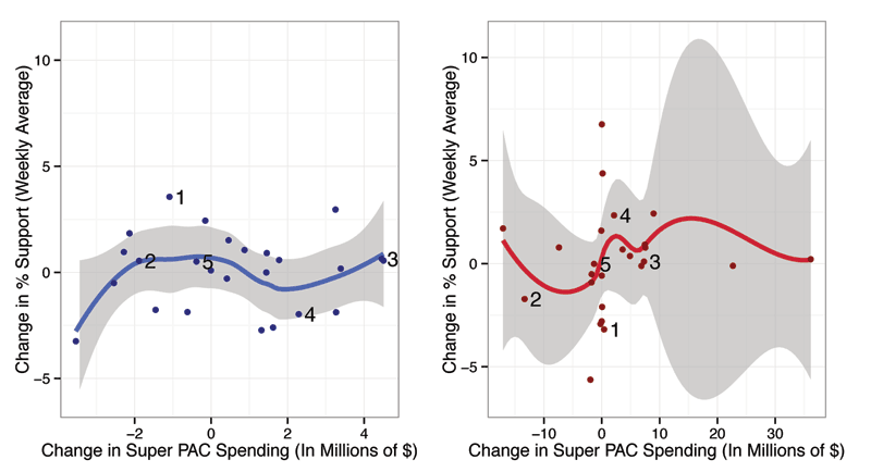
Figure 7. Change in polling over change in spending by candidate. Important events are indicated as follows: (1) Paul Ryan VP selection, (2) Republican National Convention, (3) Democratic National Convention, (4) 47% video leaked, and (5) first presidential debate. We include a loess smoother to highlight a relationship between change in support and change in spending. Again, the gray bands surrounding the curves indicate uncertainty in the smoothing curve.
Figure 8 shows the polling margin (Obama – Romney) over time, colored by swing states versus the national polls. The six event markers previously used are displayed. It can be seen that Obama consistently maintained an advantage in swing states relative to his national numbers. This is particularly true immediately following the first presidential debate, in which Obama’s swing state polling support decreased much slower than his national polling support. The time periods before and after July 15 are shaded in the same manner as Figure 6. It does not seem this spending increase had a measurable effect on the overall trend in the polls at this time.
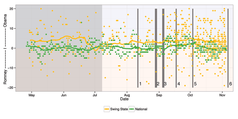
Figure 8. Polling margin (Obama – Romney) over time, swing states versus national polls. Shaded region indicates a period of lower spending by super PACs supporting Romney, and unshaded region indicates a period of higher spending. Important events are indicated as follows: (1) Paul Ryan VP selection, (2) Republican National Convention, (3) Democratic National Convention, (4) 47% video leaked, (5) first presidential debate, and (6) Election Day. This plot uses exponential smoothing to show the trends in polls over time rather than a loess smoother, as we have used previously.
Note that this plot uses exponential smoothing to show the trends in polls over time rather than a loess smoother, as we have used previously. When using the loess smoother, the future polling numbers were heavily affecting the smoothed trend line, which was undesirable. This is because the loess smoother takes into account points past and future with equal weight when showing the trend. However, the exponential smoothing method places importance on past points with exponentially decreasing weights as the points become further from the event, limiting the impact of future polling on the current smoothed trend. We implemented the exponential smoothing method using the forecast and zoo packages in R.
Conclusions/Future Work
Ultimately, our findings suggest that while election spending was a significant aspect of the 2012 election, it is not clear whether the existence of super PACs had a measurable impact on the outcome of the presidential race. Instead, the events that garnered large amounts of media coverage, such as the 47% video and the first presidential debate, seem to have had the most noticeable effect on the polling. Furthermore, our analysis did not take into account the spending done by the candidates, themselves. It may be that such spending muted the effect of super PAC spending.
We did discover interesting spending patterns by the super PACs. Although super PACs supporting Romney spent significantly more over the course of the campaign, they spent less than super PACs supporting Obama in all but one week from mid-May until mid-July. This is in spite of the Republican primary being effectively finished by late April. It will be interesting to see whether large spending begins earlier in the election season in future presidential campaigns.
Our analysis also makes clear that Obama’s polling held up more strongly in the swing states than in the national polling throughout the campaign. This advantage was evident in the election results, as well. According to the certified vote tally from the Federal Election Commission, Obama won the overall popular vote by 3.85%. But he won Colorado, the state that put him over the 270 electoral votes needed for victory, by 5.37%. This suggests Obama could have lost the popular vote by around 1.5% and still have been elected president of the United States.
Another interesting feature of our analysis is the non-uniform effect across swing states of the major events in the campaign on the polling. For instance, Ryan’s selection as Romney’s vice presidential nominee seemed to have had no effect on the polls in his home state of Wisconsin. However, in Missouri, Ryan’s selection coincided with a noticeable increase in support for Romney. A similar trend can be seen with the release of the 47% video. Following the release, Obama’s support seemed to expand in Ohio. But, in Colorado, an opposite effect is observed. The only event that seemed to produce a rather uniform change in the polls was the first presidential debate, where Romney gained support in nearly all swing states.
An extension of this research should take into account spending done by the candidates, themselves, in addition to independent expenditures. This would allow for a more informed look at the relative spending difference and how it may or may not correlate with changes in the polling averages.
Another area of exploration would be the purpose field of the independent expenditures data set. Our analysis attempted to categorize spending entries into broad buckets, but many of the entries in the database have more specific information. For instance, an ad buy may list the name of the ad as well as the state the ad is running in. It also may be possible to incorporate another data source to link the expenditure entries with ad buys in particular states.
1. As of January 1, 2013, NationalPolls.com has taken down their website, so we are working with a stored copy of their data.
Supplemental Material
Supplemental material, including code and data sets, are available here.
Further Reading
AP/The Huffington Post. 2012. Restore Our Future, pro-Mitt Romney super PAC, releases new ad touting Olympics stewardship.
Baum, Laura. 2012. Presidential ad war tops 1M airings.
Cook, Dianne et al. 2012. Election 2012.
Federal Election Commission. 2008. 2008 independent expenditure summaries – presidential candidates.
Federal Election Commission. 2013. Official 2012 presidential general election results.
Jones, Jeffrey M. 2012. Romney narrows vote gap after historic debate win.
Silver, Nate. 2012. Which polls fared best (and worst) in the 2012 presidential race.
Walsh, Kenneth T. 2012. Super PAC American Crossroads becoming key to Romney campaign.
About the Authors
Andee Kaplan is a graduate student at Iowa State University in the department of statistics. She holds a BS and MA in mathematics from The University of Texas at Austin. Her research interests include statistical computing, data visualization, and statistical graphics. She is working on an interactive web application to visualize communities in a graph framework.
Eric Hare is a graduate student at Iowa State University in the department of statistics. He graduated from the University of Washington in 2012 with a double degree in statistics and computer engineering. His research interests include statistical computing, data analysis, statistical graphics, and experimental design. He has spent two years working at TIBCO Software designing an automated R package compatibility framework. He is now developing an interactive web application to analyze the properties of peptide libraries.
Heike Hofmann is professor of statistics at Iowa State University. She earned her PhD in statistics from Augsburg University in Germany. Her areas of interest include statistical computing, exploratory data analysis (particularly of large data), multivariate categorical data analysis, and interactive statistical graphics. She is the author of Graphical Tools for Exploration of Multivariate Categorical Data and has contributed to Graphics of Large Data and Interactive and Dynamic Graphics for Data Analysis: With Examples Using R and GGobi.
Dianne Cook is a professor at Iowa State University in the department of statistics and statistical laboratory and a Fellow of the American Statistical Association. Her research concentrates on the visualization of high-dimensional data, which makes contributions to the areas of dynamic graphics, exploratory data analysis, data mining, multivariate statistical methods, and statistical computing. She is an author of the freely available visualization software GGobi and its predecessor, XGobi, and involved with the development of several bioconductor packages, including explorase for visualizing transcriptomics data and ggbio for genomic data.


This is an excellent article on an important topic. The statistics profession should aspire to be associated with the objective analysis of such important issues.