
Disease Surveillance: Detecting and Tracking Outbreaks Using Statistics

Throughout history, the human race has periodically been ravaged by disease. One of the most-extreme examples is the bubonic plague or Black Death pandemic of the 14th century. Caused by the Yersinia pestis bacteria, the plague is thought to have originated in Central Asia and was propagated via rat-borne fleas, where it spread through the Middle East and Europe, killing—by some estimates—60% of Europe’s population.
Plague pandemics repeatedly returned through the 1800s and, in fact, the plague still occurs throughout the world, including the United States, although it is now treatable with antibiotics and only infects a small number of people.
Medical and public health advances have essentially eliminated the chances of another plague pandemic, but advances in transportation facilitate people (and animals, insects, and agriculture) moving around the world with greater efficiency than ever, so other diseases still pose a significant pandemic threat to human welfare. For example, recent disease outbreaks include:
- • West Nile virus, which is transmitted by mosquitoes, arrived in the U.S. in 1999; through 2015, it infected 43,937 and killed 1,911 people.
- • Severe acute respiratory syndrome (SARS), which is transmitted person-to-person via sneezing, touch, or other close contact, infected 8,098 people worldwide in 2003, of whom 774 died.
- • H1N1 “swine flu” pandemic, which was first detected in the United States in April 2009 and from April 12, 2009–April 10, 2010, resulted in approximately 60 million flu cases, almost 275,000 hospitalizations, and more than 12,000 deaths in the United States alone.
- • Ebola is a highly lethal virus, with fatality rates ranging from 25%–90%. It is spread through bodily fluids, which must enter the body through a mucous membrane (e.g., mouth, nose, eyes) or an opening in the skin. It is therefore not highly contagious, but is dangerously infectious, in the sense that very few virions are needed to infect a person who has been exposed.
- • Most recently, the Zika virus became an issue. It is transmitted by Aedes Aegypti, and probably Aedes Albopictus, both species of mosquito and can spread between humans via sexual contact or blood transfusion, or from pregnant mother to fetus. Although rarely fatal, Zika can cause microcephaly and other severe brain defects in babies born to women who had Zika during pregnancy.Furthermore, the threat of bioterrorism makes timely and effective disease surveillance as much a national security priority as a public health priority.
As shown in Figure 1, due to significant improvements in medical and public health practice, mortality from infectious disease in the United States is significantly lower today than it was a century ago (although it has leveled off since the 1950s) . While good news, this lower overall “background” incidence of infectious disease does not eliminate the possibility that another disease pandemic might occur in the future.
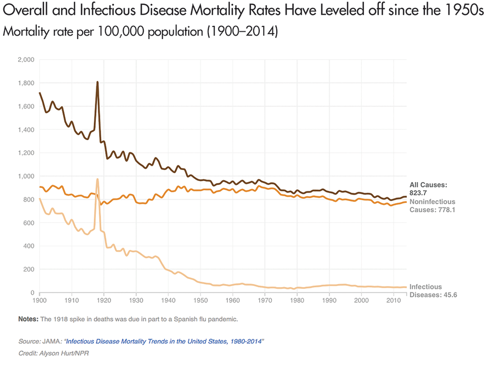
Figure 1. Overall and infectious disease mortality in the United States from 1900 to 2014. The spike at 1918 in Figure 1 is the U.S. mortality rate during the Spanish flu outbreak, where roughly 1 person in 100 who contracted an infectious disease died, and during which the Spanish flu killed an estimated 675,000 people in the United States.
Source: http://n.pr/2giRnOG.
For example, the highly pathogenic avian influenza (HPAI) or “bird flu” has the potential to cause a large-scale pandemic should it ever mutate into a form that is highly transmissible between humans. However, because the virus does not (yet) transmit efficiently between people, there has been no significant human outbreak.
Should the virus mutate, what could a bird flu outbreak look like? To put it in perspective, the 1918–1919 Spanish flu, which is the likely ancestor of the human and swine flu viruses, infected an estimated 500 million people, or about one-third of the world’s population; the total number of deaths has been estimated at about 50 million and may have been as high as 100 million people.
Disease “Early Warning Systems”
Seeking to avoid another pandemic, public health agencies conduct disease surveillance, more formally called epidemiologic surveillance, by actively gathering and analyzing data related to human health and disease to provide early warnings of human health events and rapidly characterize disease outbreaks.
Epidemiologic surveillance has two main objectives: to enhance outbreak early event detection (EED) and to provide outbreak situational awareness (SA). The United States Centers for Disease Control and Prevention (CDC) defines them as:
- • Early event detection is the ability to detect, at the earliest possible time, events that may signal a public health emergency.
- • Situational awareness is the ability to use detailed, real-time health data to confirm or refute, and to provide an effective response to, the existence of an outbreak.
Situational awareness is essential for understanding when and where to intervene, as well as whether the intervention is having the desired effect. It is also focused on monitoring an outbreak’s magnitude, geography, rate of change, and life cycle. Early event detection is critical for catching an outbreak as soon as possible, so medical and public health personnel can intervene before it grows into a pandemic. It comprises case and suspect case reporting by medical and public health professionals, along with statistical analysis of health-related data. It is the latter with which we are concerned here.
Statistical Methods Applied to Epidemiologic Surveillance
The use of statistical analyses to help determine the origin of disease goes back to the Soho epidemic of 1854 in England, when John Snow, MD mapped cases of cholera to support his theory that the disease was transmitted by contaminated water. Figure 2 is Snow’s now-famous plot, showing simultaneously the number of cholera deaths by city address and the locations of each of the city’s water pumps. The result is a clear visual association between areas of higher death rates from cholera and specific water pumps, particularly the Broad Street pump.
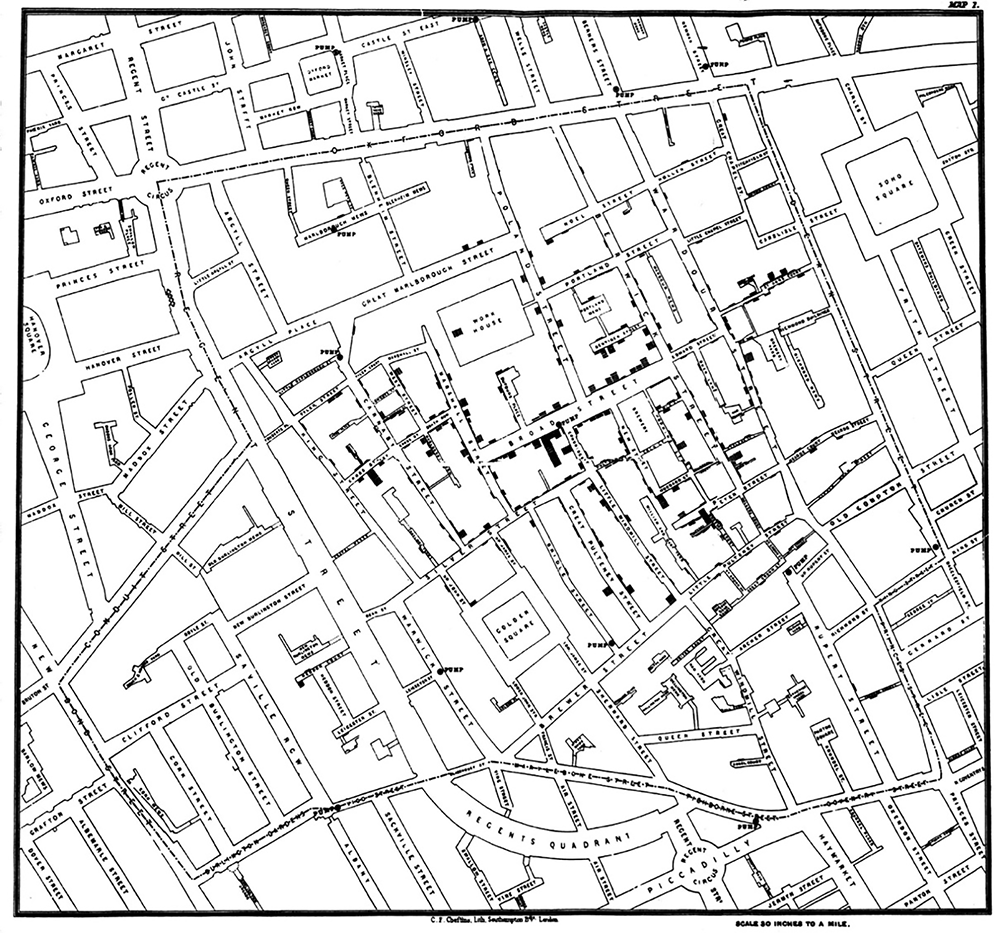
Figure 2. Dr. John Snow’s map of the 1854 London cholera epidemic. Pump locations are depicted by dots in middle of streets and bars are proportional to number of deaths at each address. In center is the Broad Street pump.
Source: http://bit.ly/2FNOnJz.
Epidemiologists and public health professionals are often called upon to determine the cause or causes of a particular disease outbreak, much as Snow first did almost two centuries ago. A defining feature of such an investigation is that the outbreak has already been identified. This is often referred to as event-based surveillance.
In event-based surveillance, the investigation is a retrospective effort focused on trying to determine the cause of a known outbreak. In contrast, today’s epidemiologic surveillance can also be a prospective exercise in monitoring populations for potential disease outbreaks by routinely evaluating data for evidence of an outbreak before the existence of a confirmed case and perhaps even before any suspicion of an outbreak.
Temporal Detection: SARS Outbreak in Monterey, California
Syndromic surveillance is a specific type of prospective epidemiologic surveillance that is based on indicators of diseases and outbreaks, not confirmed cases, with the goal of detecting outbreaks before medical and public health personnel would otherwise note them. It is based on the notion of a syndrome, which is a set of non-specific pre-diagnosis medical and other information that may indicate the presence of a disease. It actively searches for evidence of possible outbreaks, perhaps even before there is any suspicion that an outbreak has occurred.
The motivating idea is that serious diseases often first manifest with more benign symptoms before they can be diagnosed for what they really are. For example, someone who contracts smallpox exhibits flu-like symptoms for the first week or two afterward. Thus, a widespread smallpox outbreak might first become evident as an increase in “influenza-like illness” (ILI) syndrome counts before a clinician diagnoses the first smallpox case.
To illustrate syndromic surveillance, Figure 3 compares ILI syndrome counts to diagnosed case counts for the seasonal flu that occurred in Monterey, California, in early 2009 and then two subsequent H1N1 “swine flu” outbreaks. Those three outbreaks appear in gray, with superimposed time series of the weekly percentage of patients diagnosed with ILI from the California Sentinel Provider system, Monterey hospital emergency rooms, and Monterey public health clinics. Smoothing lines better show the underlying trends.
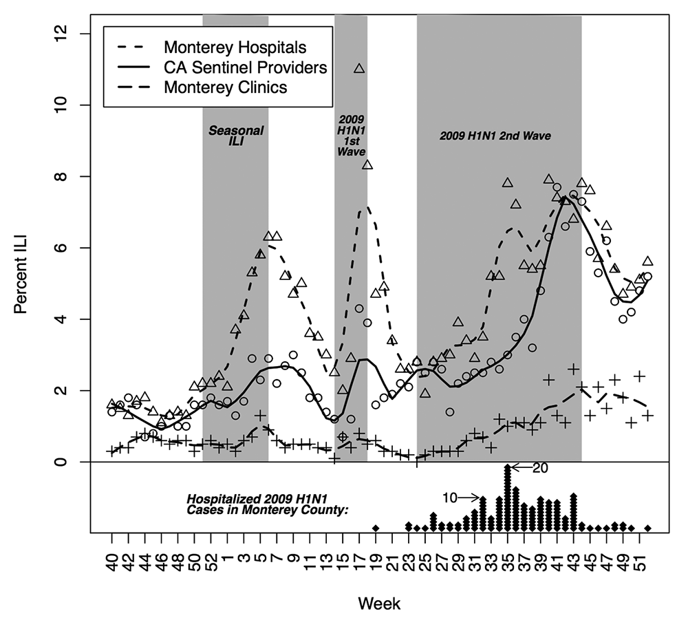
Figure 3. Percentage of patients diagnosed with ILI from September 28, 2008 (week 40), through January 2, 2010 (week 52), for: (1) the California Sentinel Provider system, (2) Monterey hospital emergency rooms, and (3) Monterey public health clinics. The diamonds represent laboratory-confirmed hospitalized cases of 2009 H1N1 in Monterey County, where each diamond represents one person and is plotted for the week the individual first became symptomatic due to 2009 H1N1 infection.
Source: Hagen, et al., 2011.
The outbreak periods are:
- • Seasonal flu outbreak: December 12, 2008 (week 50)–February 13, 2009 (week 6)
- • First H1N1 outbreak: April 6, 2009 (week 14)–5/8/2009 (week 18)
- • Second H1N1 outbreak: June 15, 2009 (week 24)–November 6, 2009 (week 44)
where the term “outbreak period” is defined as when the syndrome counts were increasing from their nominal state up to some peak.
At the bottom of Figure 3, the diamonds are laboratory-confirmed, hospitalized cases of 2009 H1N1 in Monterey County. Each diamond represents one person and is plotted for the week the individual first became symptomatic due to 2009 H1N1 infection.
During this same period, the Monterey County Health Department (MCHD) also conducted syndromic surveillance, by monitoring “chief complaint” data from the county’s four hospital emergency rooms (ERs) and six public health clinics, as an early warning system for various types of disease outbreaks. A chief complaint is a brief written summary of the reason or reasons describing why an individual went to a medical facility. The MCHD monitored a number of syndromes, including ILI, gastrointestinal, upper respiratory, lower respiratory, and neurological.
To distill the chief complaints into syndrome indicators, the chief complaint text is searched and parsed for key words. Here, the ILI syndrome is defined as: (“fever” and “cough”) or (“fever” and “sore throat”) or (“flu” and not “shot”). Thus, if someone went to a Monterey County ER and said either that they had a fever and cough, or a fever and sore throat, or had the flu (but had not gotten a “flu shot”), that person is classified as having the ILI syndrome.
To monitor the population, one must first model the “normal” state of disease incidence or chief complaints in the population, which will fluctuate naturally, and which—for the purposes of detecting outbreaks—is just noise.
Second, deviations from that normal background incidence must be monitored to look for outbreaks, part of which requires setting some sort of threshold level above which an algorithm will produce a signal. Key to note is that such a signal, like all statistical signals, could be either a true or false positive (just like the lack of a signal could be a true or false negative), so the signals produced by the algorithm will require investigation to determine whether it is a true positive, meaning an outbreak is occurring.
Without going into all of the details, there are any number of ways to model the normal state of the population. Then, borrowing from the statistical process monitoring literature, one algorithm useful for assessing whether an outbreak is occurring is the cumulative sum (CUSUM). It works by summing up observations appropriately and producing a signal when the sum exceeds some threshold.
Figure 4 shows the resulting CUSUM signals superimposed on the ILI chief complaint count time series. The circles are the aggregate daily ILI counts for Monterey County clinics and the black line is a locally weighted smoothing line to show the underlying trends. A signal on a particular day is denoted by a vertical line “|” and the heavier black bars indicate a sequence of daily signals.

Figure 4. Algorithm signal times. A vertical line “|” denotes a signal on a particular day and the heavier black bars indicate a sequence of daily signals.
Source: Modified from Hagen, et al., 2011.
In Figure 4, we see two things. First, the syndrome count trends match quite well with the three outbreak periods, with the black line clearly increasing in each of the three periods, which suggests that mining the chief complaint text for appropriate key words does provide information about disease outbreaks. Second, the algorithm routinely signals during the outbreak periods, as well as some times outside those periods.
However, comparing the signals to the time series, we do see that the signals correspond well to increases in the daily ILI syndrome counts, where it could be that the syndromic surveillance is picking up additional information that was not present or was less-obvious in the diagnosed ILI time series of Figure 3.
Spatio-temporal Detection: Sudden Infant Death Syndrome and Lyme Disease
The foregoing analysis is an example of early event detection. However, to be useful for situational awareness, the data also must have a geographic component. Typically, such data are collected in each of several geographical units—states, counties, ZIP codes, or census tracts.
We would expect a higher correlation in the disease counts for regions that are close together, than for those that are far apart. The problem is complicated by the irregular placement of the counties (or other geographically defined regions). For a rare disease, disease counts and rates may vary greatly even for regions that are close together. It is, thus, helpful to have a method of “smoothing” the disease rates across regions. For example, disease rates in neighboring counties for a given time period may be 4, 0, and 7 per 100,000. It seems reasonable that the estimate of 7 per 100,000 is probably too high, and the estimate of 0 per 100,000 is almost certainly too low. Since this phenomenon is common when the observed counts are small, we often look to smooth the estimates.
A choropleth map is a plot of the geographic regions, color-coded to indicate the value of some variable, such as the disease rate. Darker colors usually indicate higher rates of the disease. Figure 5 (top) shows the raw rates of sudden infant death syndrome (SIDS) for the counties in North Carolina over the years 1979 to 1983. These rates show quite a bit of randomness, but some regions with high rates seem to appear.
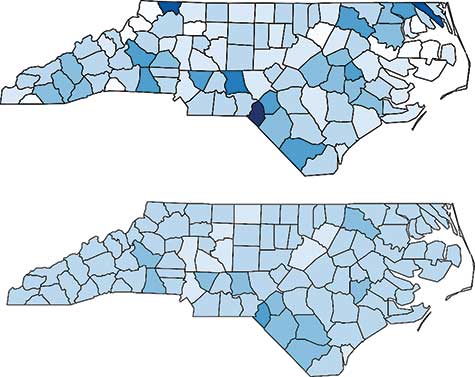
Figure 5. SIDS rates in North Carolina from 1979–1983. Raw rates are shown in the top graph, and the rates smoothed by a conditional autoregressive model are shown in the bottom graph.
Statisticians and epidemiologists assign two sources of variability. One is the county-by-county variability, similar to the random error term in a linear model. The other involves the correlation between neighboring counties. (Counties are defined to be neighbors if they share a common border.) This correlation structure is similar to that of autoregressive time series models, where the current outcome depends on the outcome of the most recent time periods; in other words, the only “neighbors” of the current time are the most recent time periods.
Spatial models are a bit more complicated because the neighbor structure is more complicated. Such models are called conditional autoregressive (CAR) models. The bottom graph shows the SIDS rates that have been fit using a CAR model to account for both uncorrelated and correlated heterogeneity. Since the same values were used for the breaks (that is, the intervals that determine the shade of blue), the bottom graph shows the smoothing effect of the CAR model. Scotland County is the region with the highest SIDS rate. It is in the southern part of the state, southeast of Fayetteville and along the South Carolina state line.
Knowing the regions with higher rates allows investigators to search for possible causes. CAR models are capable of including covariates, often demographics characteristics of each county, in the model.
The North Carolina SIDS data are just a snapshot of one particular time period (1979–1983). Often, data are collected across counties for each time period (weekly, monthly, yearly). The surveillance problem now looks at changes across time and across the geographic regions. For illustration, we look at the occurrence of Lyme disease in Connecticut. Connecticut has only eight counties; only Delaware, DC, Hawaii, and Rhode Island have fewer.
Three of the counties are large, with nearly 1 million residents each: Fairfield, Hartford, and New Haven; the others—Litchfield, Middlesex, New London, Tolland, and Windham—have between 100,000 and 200,000 residents each.
Lyme disease is the result of infection by Borrelia burgdorferi, which is usually transmitted by the deer tick. Lyme disease is a flu-like illness, with symptoms that include fever, muscle pain, chills, and nausea. Some patients develop a rash that is shaped like a “bull’s-eye.” Without early detection and treatment, Lyme disease can become chronic. Incidence rates of Lyme disease are highest in the northeast. Only Maine, Pennsylvania, Rhode Island, and Vermont have incidence rates exceeding Connecticut.
Figure 6 shows choropleth maps for the Connecticut counties for each of the years 1996 through 2015. Incidence rates are lower now than in the early 2000s. The high-incidence region seems to be in the eastern part of the state, particularly Tolland, Windham, and New London counties. These counties tend to be more rural and have more deer ticks.
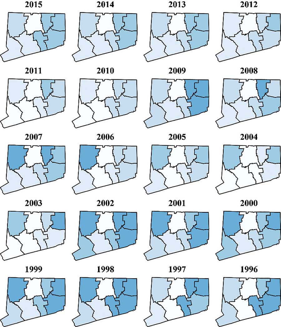
Figure 6. Choropleth maps for Lyme disease rates in Connecticut from 1996 to 2015.
Data source: http://www.ct.gov/dph/cwp/view.asp?a=3136&q=399694.
Figure 7 shows time series plots for each of the eight counties. From this, we can see that the rates were high from 1998 through 2002, but dropped sharply in 2003. The rates remained relatively low except for 2009, when the rates spiked in the same three eastern counties. (Figure 7 shows more detail than Figure 6, but the geographic information is only in Figure 6.)
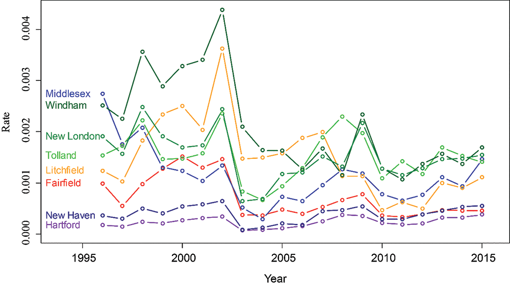
Figure 7. Lyme disease rates for each county in Connecticut from 1996 to 2015.
Data source: http://www.ct.gov/dph/cwp/view.asp?a=3136&q=399694.
One example of event-based surveillance is the United States Centers for Disease Control and Prevention (CDC) National Notifiable Diseases Surveillance System (NNDSS), which aggregates and summarizes data on specific diseases that healthcare providers are required by law to report to public health departments. The NNDSS can be used to illustrate the historical limits statistical method for disease detection.
Public health practitioners use the historical limits method to compare the observed incidence of a particular disease from a current time period to incidence data from equivalent historical periods. For example, the NNDSS uses it to characterize the current incidence of various reportable infectious and non-infectious diseases, such as anthrax, cholera, plague, polio, and smallpox—each week, each state reports counts of cases for each of the reportable diseases to the CDC. The CDC then compares the counts from the past month for each disease to historical average incidence rates from equivalent periods in the past five years.
One specific application, as shown in Figure S-1, is the CDC’s Morbidity and Mortality Weekly Report (MMWR) “Notifiable Diseases and Mortality Tables,” which plot various reportable diseases and show when the counts observed in the past four weeks exceed the average observed in the past five years, plus or minus two standard deviations. Figure S-1 shows that in the last week of 2015, meningococcal disease count from the preceding four weeks was more than two standard deviations below its historical norm (which is evident in graph because of the gray crosshatching on the bar associated with meningococcal disease).

Figure S-1. Figure I from “Notifiable Diseases and Mortality Tables” for week 52 of 2015.
Source: https://bit.ly/2GFWXv9.
To perform this calculation, the most recent four-week totals for each of the notifiable diseases, Ti,j,k for reportable disease i, in week j, and year k, are compared to the mean number of cases reported for the same four-week period, the preceding four-week period, and the succeeding four-week period for the previous five years as follows. For the average of the 15 historical four-week periods, calculated as:
![]()
and its associated standard deviation, calculated as
![]()
the historical upper limit (UL) and lower limit (LL) for reportable disease i, in week j, and year k, are ULi,j,k = x̄i,j,k + 2si,j,k and LLi,j,k = x̄i,j,k – 2si,j,k. (The factor 2 used in the upper and lower limits is chosen because most of the probability from a distribution falls between the mean minus two times the standard deviation and the mean plus two standard deviations. For the normal distribution, this interval accounts for about 95% of the probability. Thus, using a factor of 2 makes it unlikely that a point outside the interval occurred by chance, reinforcing the hypothesis that a change occurred.) The part of the count that exceeds these limits are shaded in gray crosshatching.
Interestingly, for reasons that are not entirely clear to us, the bars plotted in Figure S-1 are of Ti,j,k / x̄i,j,k plotted on a log scale, where the limits are then UL*i,j,k = 1 + 2si,j,k / x̄i,j,k and LL*i,j,k = 1 – 2si,j,k / x̄i,j,k. Plotting the ratio does make a direct comparison between the observed total and the historical average, but unless the total exceeds the upper or lower limit, it does not provide any information about how “far away” the observed total is from the average. In our opinion, the graph would be much easier to read and interpret if it plotted each of the most-recent four-week totals Ti,j,k in terms of the number of standard deviations they are above or below their associated historical average x̄i,j,k.
Furthermore, a time series plot for each disease, much like a control chart from the statistical process monitoring literature, would provide additional information within which to put the observed deviations (and control limits) into a useful perspective.
Epidemiologic surveillance also focuses on detecting chronic and non-communicable diseases as well. For instance, the National Cancer Institute tracks many cancers, including leukemia. Leukemia surveillance often looks for “hot spots” of the disease, where the rates are much higher than expected.
The CDC maintains surveillance for various forms of heart disease. The National Highway Transportation Safety Administration (NHTSA) routinely performs surveillance on traffic- and non-traffic-related deaths. In most states, foodborne diseases, such as Escherichia coli (E. coli), are reportable diseases, and are monitored much like communicable diseases.
Conclusions
The two main aspects of disease surveillance are (1) early event detection and (2) situational awareness, and statistical methods have played and continue to play an important role in both.
In early event detection, the goal is to separate the signal from the noise. We want to know when the number of cases or the rate is higher than we would expect by chance. Knowing this allows investigators to look for causes. This is particularly important for foodborne diseases such as E. coli, where it is crucial to find the source of the infection so it can be eliminated.
In situational awareness, knowing the status of an infectious disease is important in investigating an outbreak. For diseases such as Lyme disease, which are not communicable from person to person, it is important to identify trends in the data, as well as the hot spots where the incidence rate is particularly high. This is also true for surveillance of other noncommunicable diseases such as cancer and heart disease, as well as for other causes of morbidity or mortality, such as car accidents.
Finally, surveillance need not involve the number or rate of cases. Surveillance of the prevalence of deer ticks may help predict an outbreak of Lyme disease. Google Flu Trends monitored the terms that people would search for on their search engine in an effort to monitor the incidence of influenza. For a while, it was able to detect outbreaks sooner than other methods of surveillance. As pointed out in an article in Science, though, Google Flu Trends significantly overpredicted the actual incidence of influenza in early 2013. As a result, Google Flu Trends is no longer operating.
Rat populations, which are related to plague (Yersinia pestis) outbreaks, can be monitored. Plague affects rats the same as humans and is communicated by fleas. Mary Dobson, in Disease: The Extraordinary Stories Behind History’s Deadliest Killers, describes a particular type of surveillance done centuries ago: “In India and China, folk wisdom warns that when the rats start dying, it is time to flee.” Disease surveillance has come a long way since then, but the spirit has remained the same: Know when diseases are coming and take the necessary steps to minimize the damage they can do.
Further Reading
Banerjee, S., Carlin, B.P., and Gelfand, A.E. 2015. Hierarchical Modeling and Analysis for Spatial Data, second edition. Boca Raton, FL: CRC Press.
Brookmeyer, R., and Stroup, D.F. 2004. Monitoring the Health of Populations: Statistical Principles and Methods for Public Health Surveillance. Oxford, UK: Oxford University Press.
Dobson, M. 2007. Disease: The Extraordinary Stories Behind History’s Deadliest Killers. London, UK: Quercus.
Hagen, K.S., Fricker, Jr., R.D., Hanni, K., Barnes, S., and Michie, K. 2011. Assessing the Early Aberration Reporting System’s Ability to Locally Detect the 2009 Influenza Pandemic. Statistics, Politics, and Policy 2(1).
Fricker, Jr., R.D. 2013. Introduction to Statistical Methods for Biosurveillance: With an Emphasis on Syndromic Surveillance. Cambridge, UK: Cambridge University Press.
Lawson, A.B., and Kleinman, K., eds. 2005. Spatial and Syndromic Surveillance for Public Health. Hoboken, NJ: Wiley.
Lombardo, J.S., and Buckeridge, D.L. 2007. Disease Surveillance: A Public Health Informatics Approach. London, UK: Wiley-Interscience.
M’ikanatha, N.M., Lynfield, R., Van Beneden, C.A., de Valk, H., eds. 2013. Infectious Disease Surveillance. Hoboken, NJ: Wiley-Blackwell.
Rigdon, S.E., and Fricker, Jr., R.D. 2015. Health Surveillance in Innovative Statistical Methods for Public Health Data, in D-G Chen and J.R. Wilson, eds. Springer, 203–249.
Rigdon, S.E. and Fricker, Jr., R.D. 2018. Monitoring the Health of Populations by Tracking Disease Outbreaks and Epidemics: Saving Humanity from the Next Plague. Boca Raton, FL: Chapman and Hall/CRC.
Rogerson, P., and Yamada, I. 2009. Statistical Detection and Surveillance of Geographic Clusters. Boca Raton, FL: CRC Press.
About the Authors
Ronald D. Fricker, Jr. is professor and head of the Virginia Tech Department of Statistics, a Fellow of the American Statistical Association (ASA), and an elected member of the International Statistical Institute. Fricker’s current research focuses on the performance of various statistical methods for use in disease surveillance and statistical process control methodologies more generally. He is the author of Introduction to Statistical Methods for Biosurveillance, published by Cambridge University Press, and has published in Statistics in Medicine, the Journal of the Royal Statistical Society, Environmental and Ecological Statistics, the Journal of Quality Technology, Quality Engineering, and Information Fusion.
Steven E. Rigdon is professor of biostatistics at Saint Louis University and Distinguished Research Professor Emeritus at Southern Illinois University Edwardsville. He is the author of Calculus, 8th edition and 9th edition, published by Pearson, and Statistical Methods for the Reliability of Repairable Systems, published by Wiley. His research interests include disease surveillance, quality surveillance and control, recurrent events, and statistical methods in sports. He is a Fellow of the ASA and is currently the editor of the Journal of Quantitative Analysis in Sports.