
The Shape of Things: Topological Data Analysis

An interesting feature of much modern Big Data is that the data we collect, or the data we want to analyze, are not necessarily in the traditional matrix or array form familiar from our textbooks. They may be coerced to such a format for relative ease of analysis, but this is not a strong justification. Past columns have explored new methods that exploit the natural structure of such data sets more directly. Topological data analysis (TDA) is one such method.
Much daunting mathematics lies behind the methods of TDA, but it is possible to gain an idea and understanding of the approach and its potential usefulness even without a deep dive into the intricacies of topology, homology classes, and the like. In fact, the basic idea is quite simple: to study data through their low-dimension topological features, which translate into connected components (dimension 0), loops (dimension 1), and voids (dimension 2).
Higher dimensions do exist, but often do not contain much useful information. For three-dimensional data, up to the second dimension topological features can be considered at most. A good analogy to make the meaning of these features concrete is a piece of Swiss cheese. The piece of cheese itself is one connected component. The holes that are apparent on the surface are dimension 1 features, while the internal holes inside the cheese (not apparent from the surface because they are completely surrounded by cheese) are the dimension 2 features.
How can topological features be extracted and analyzed for a given data set? One of the tools frequently used in TDA to study the shape of data is persistent homology. Persistent homology can be explained without mathematics using an example of point cloud data, commonly considered in TDA.
Suppose there is a “cloud” of data consisting of n points (e.g., points scattered in space). In many cases, the topological features cannot be extracted directly from such a data set. Consider the raw point cloud data without any structure; since each data point is a connected component in and of itself, the only information provided is that there are n 0-dimensional topological features. This is not very interesting from a data analysis point of view, nor does it give insight into the true underlying structure of the point cloud—from what shape, if any, were the data sampled? Hence, to represent the underlying shape of such a collection of data, TDA builds an abstract structure upon the individual points.
There are many ways to construct such a structure. A common method is to draw a series of expanding balls covering each point. Points are connected to each other with edges or triangles if their balls overlap.
Figure 1 shows an example of point cloud data with 16 points. Here, the balls surrounding each of the points construct an abstract structure, capturing two connected components and one loop. (This particular structure captures only one large loop, ignoring a smaller loop that is evident in the raw data.)

Figure 1. Example of point cloud data and their abstract structure.
What if the radius of the covering balls changes? Can a structure with balls with different radius capture both loops? Figure 2 shows how the abstract structure changes with the radius of the ball. The second panel captures only the one small loop, while the third captures just the large loop. Indeed, the moment in which the two loops exist simultaneously is short.
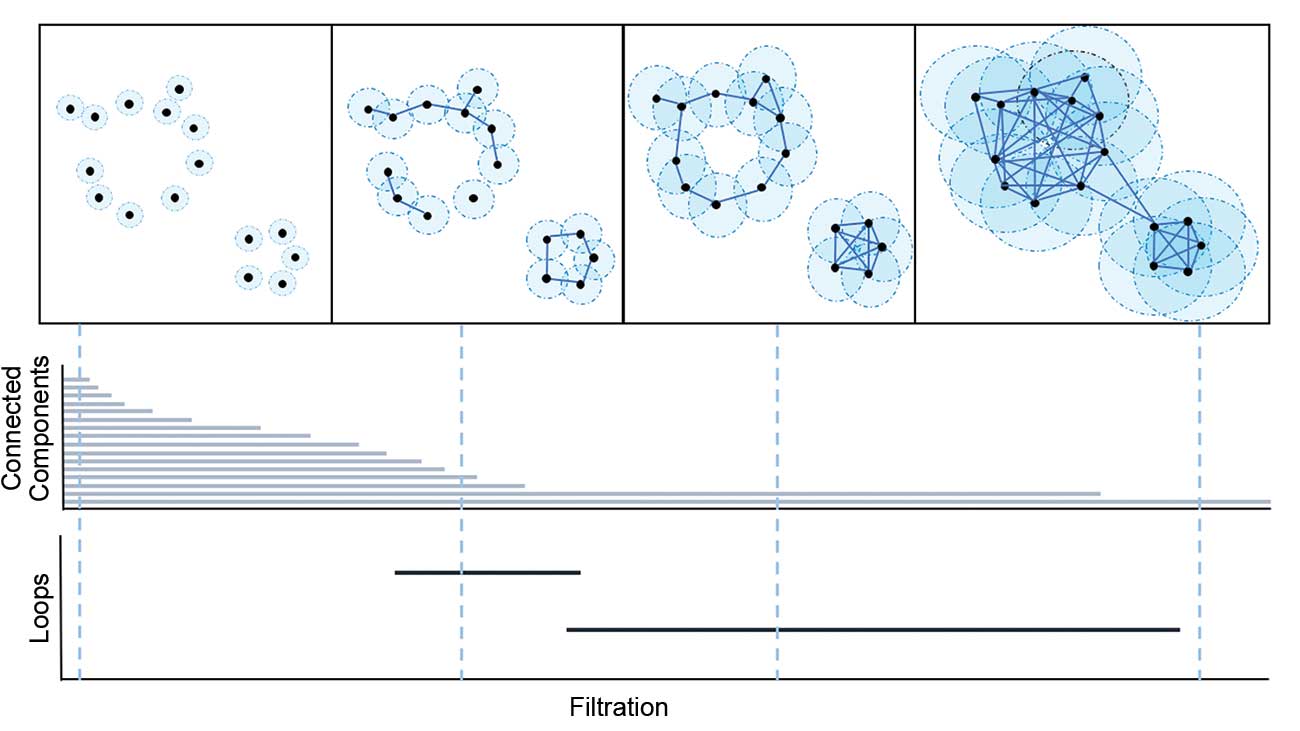
Figure 2. Filtration of example in Figure 1 and the corresponding barcode plots.
If the data are even-more complex (i.e., there are numerous features), it is hard to find an appropriate radius that will capture all of the topological features. If, instead, all possible radii are considered, the set of corresponding structures can capture the relevant topological features. This is the focus of persistent homology. The set of abstract structures defined as the covering balls expand around the data points is called the filtration.
Briefly, persistent homology is a tool in TDA to track topological features that appear (birth) or disappear (death) as the filtration threshold increases. For example, assume a focus on the birth and death of connected components of the point cloud in Figure 2. In the first set, all 16 connected components are born at value 0. Thus, there are 16 “births” at 0.
As the balls increase, they begin to intersect with each other. When the covering balls of two connected components touch, one of the two components “dies” and becomes part of the other. In Figure 2, there are two connected components in the third panel, but as the balls continue to increase in radius, the large connected component on the upper left dies and is combined with the small connected component on the bottom right; by the fourth panel, they become one connected component.
Persistent homology can be summarized visually with the barcode, which plots a bar of the form [birth filtration value, death filtration value] for each feature, as shown at the bottom of Figure 2.
Another compact visual summary is the persistence diagram, which shows each topological feature’s time of birth (x-coordinate) and death (y-coordinate) with a point in the XY-plane. The persistence (or lifetime) of a topological feature corresponds to the length of each bar in the barcode, and to the distance between each point and the diagonal line in a persistence diagram. Hence, a topological feature with a long bar in the barcode (or, equivalently, one with a point far from the diagonal line in the persistence diagram) can be interpreted as containing significant topological information about the underlying structure of the data.
Figure 3 shows the three-dimensional scatter plot for point data sampled from a torus, along with the corresponding barcode and persistence diagram. In the barcode plot, there is one long bar for each of dimension 0 (connected components) and dimension 2 (voids) features, and two long bars for dimension 1 (loops) features. Similarly, one point for each of dimension 0 and dimension 2, and two points for dimension 1, are relatively far from the diagonal line in the persistence diagram.
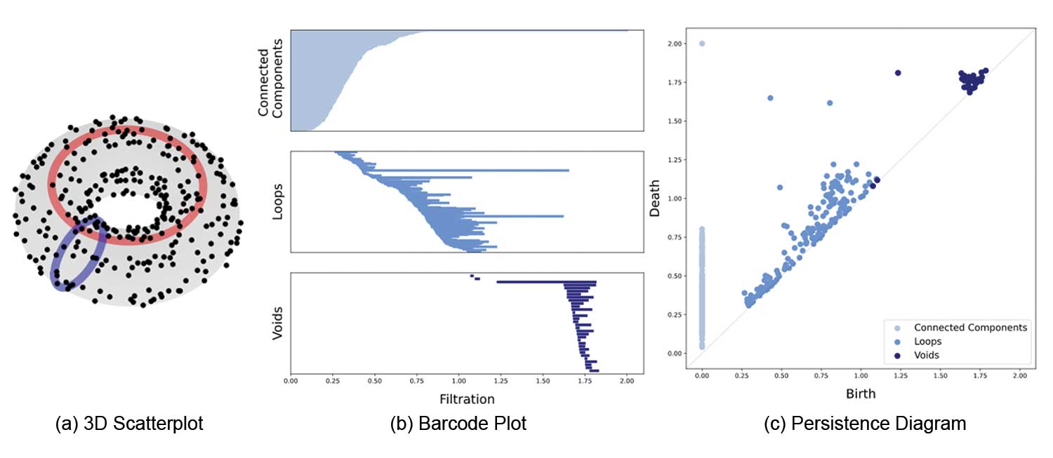
Figure 3. 3D scatterplot of points from torus, with the corresponding barcodes and persistence diagrams.
From both the barcode and the persistence diagram, it can be inferred that the data were sampled from a structure with one connected component, two loops, and one void. Those topological features actually describe the torus: It is a single connected component, with two loops (the one in the center and the one in the middle of the “tube”), and one void (the inside of the “tube”).
Other types of data can be analyzed using these methods; TDA can be applied to many data types other than point cloud data. Data in the form of functions is one example. Figure 4 gives an example of one-dimensional function data.
Unlike for point cloud data, the focus is now on connectivity of the 1-dimensional function at each function value (i.e., value on the y-axis, in this example). Thus, instead of expansion of covering balls, a horizontal line sweeps from the bottom of the graph up, and takes parts of the function below the horizontal line as connected components. This constructs a filtration of the one-dimensional function, as shown in Figure 4.
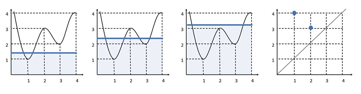
Figure 4. Filtration of a 1D function and the corresponding persistence diagram.
Births and deaths of connected components can now be tracked over the filtration values as before, where these will now correspond to peaks and troughs of the function.
For example, one connected component is born at height = 1 and dies at height = 3, and the other connected component appears at height = 2 and disappears at height = 4. The births and deaths can again be plotted in a persistence diagram, as shown in the last panel.
For a better understanding of the birth and death of topological features, animated GIFs of the persistent homology process are available here. The animated examples of point cloud data and function data will enhance understanding of how to record the birth and death of topological objects according to filtration changes in the persistence diagram.
Ways to calculate the persistent homology can vary by defining distance, a choice of filtration, and data type. To apply persistent homology in a real data setting requires considering the type of data, a suitable distance for constructing an abstract structure on the data, and how to build the filtration itself. With appropriate choices, persistent homology has been applied in various fields of data analysis.
Figure 5 is an example of TDA application in brain network analysis. It calculates persistent homology based on “functional distance” between brain regions, which in turn is based on the correlation between signals in two brain regions. Thus, persistent homology of brain networks can identify how compact brain regions are functionally connected.
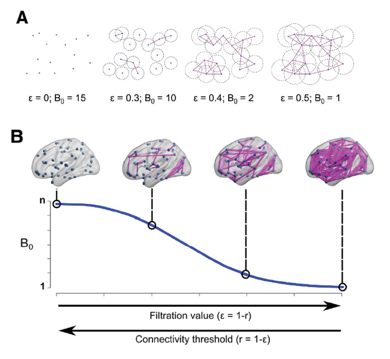
Figure 5. TDA application in brain networks (Gracia-Tabuenca, et al. 2020).
Figure 6 shows a TDA pipeline for images of handwritten digits. Here, the pixel intensities of the image are the starting point. As with the function example, the topological features are identified by pixels above or below a filtration value; as the value increases, features are born and die. In this application, feature vectors from persistent homology are used in a machine learning algorithm to classify the digit images.
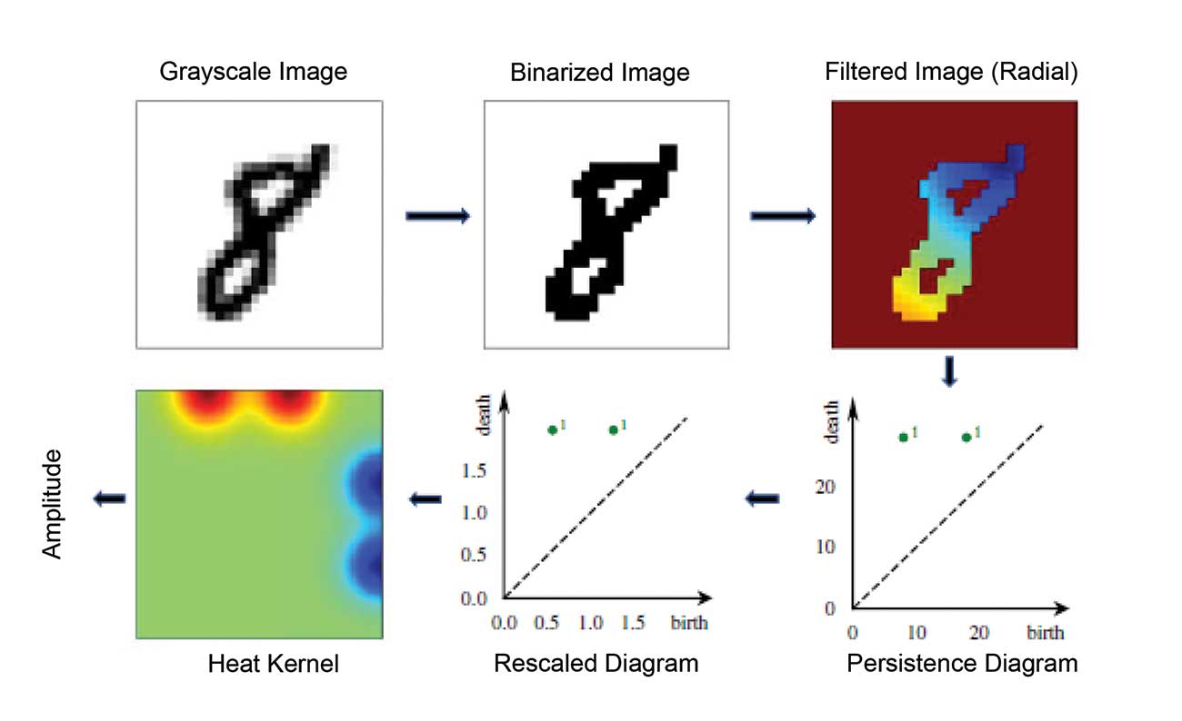
Figure 6. TDA application in digit images (Garin, et al. 2019).
Owing to its increasing popularity as an analysis tool, many powerful software packages have already been developed for implementing persistent homology. Efficient algorithms for the calculation of persistent homology have been developed with C++ libraries such as GUDHI, Dionysus, PHAT, Ripser, and Perseus. For R users, the package TDA implements the C++ libraries GUDHI, Dionysus, and PHAT to calculate persistent homology and provides persistent homology based on kernel distance estimators for analyzing the statistical significance of persistent homology features. Another R package, TDAstats, provides an R interface for the algorithm of the fast C++ library Ripser. It uses R library ggplot2, which allows users to manipulate plots easily to generate barcodes and persistence diagrams. For Python users, the C++ library GUDHI also provides a Python interface, and Python library giotto-tda provides a high-performance topological machine learning toolbox integrated with the scikit-learn API.
Although still a relatively new tool in the data analyst’s kit, TDA has been gaining in visibility for both the interesting and elegant theoretical challenges that it poses, and its potential to deliver new insights in a variety of applications, ranging from fingerprint analysis to description of proteins to classification of rock images by type. There is still plenty of work to be done, especially in terms of developing statistical theory that will allow for inference on the underlying shape of data.
Another relatively open area involves the stability or robustness of these methods—how much the results change with perturbations to the data. Along with questions about choices of distance and how to build up the structure, and what impact those have on the conclusions, there are many opportunities to contribute to this exciting and fast-growing field.
Further Reading
Adler, R. 2014. TOPOS: Applied topologists do it with persistence. IMS Bulletin 43, 10–11.
Adler, R. 2015. TOPOS: Let’s not make the same mistake twice. IMS Bulletin 44, 4–5.
Carlsson, G. 2009. Topology and data. Bulletin of the American Mathematical Society 46, 255–308.
Ghrist, R. 2008. Barcodes: The persistent topology of data. Bulletin of the American Mathematical Society 45, 61–75.
About the Authors
Hyunnam Ryu is a PhD candidate in the Department of Statistics at the University of Georgia. She received a bachelor’s degree in statistics and mathematics and a master’s degree in statistics at Kyungpook National University, South Korea. She is currently working on topological data analysis for network data.
Nicole Lazar earned her PhD from the University of Chicago and is a professor in the department of statistics at Penn State University. Her research interests include the statistical analysis of neuroimaging data, empirical likelihood and other likelihood methods, and data visualization. She also is an associate editor of The American Statistician and The Annals of Applied Statistics and the author of The Statistical Analysis of Functional MRI Data.