
Pucksberry: What We Can Learn from Hexagonal Plots of NHL Data

Kirk Goldsberry is not only a geographer by training, he’s the geekiest star of Grantland, the online magazine hosted by ESPN. He’s made his reputation by combining novel tracking data from National Basketball Association games with appealing graphical summaries to tell the stories of how players like LeBron James have changed their games over time.
Goldsberry is a good writer who can interview LeBron about his actual shot data, but aside from that there’s nothing he can do that’s beyond a capable statistician with an appreciation for the data and the tools provided by a language like R.
The elements of a “Goldsberry Plot” are threefold:
1. Shots aggregated into hexagonal bins, the most visually pleasing of all bin types.
2. Sizes of the hexagons scaled with the number of observations, like in a 2D histogram.
3. A color scheme for the hexagons to signify the fraction of shots that score, either as an absolute percentage or relative to the league mean at each position.
Basketball is far from the only sport in which this sort of data is recorded as a matter of course. The National Hockey League (NHL) has collected similar data for years, with the most reliable coming since 2008 (though, as we will see, there are still issues). Basketball and hockey are similar enough that each sport can serve as an excellent model for the other, and this isn’t the first idea cross-pollinated between the two sports. Plus/minus, or the differences in goals scored for and against a team when a certain player is on the ice, was a hockey invention from the 1950s that has found new life in the NBA, and new illumination from writers like Michael Lewis.
Goldsberry’s success is driven by both his storytelling and his high-quality SportVU data, a commercial product beyond easy access. Given the richness of data at our disposal, though, it should be easy to adapt Goldsberry’s method for evaluating pro basketball to NHL data, especially since they are essentially congruent. Plus, shots taken on a 94-by-50-foot NBA court should have better relative spatial resolution when made on a 200-by-85-foot NHL rink.
If only it were so simple.
Data Differences
At first glance, play appears to be conducted in much the same way in both sports—five players try to take shots on the opposing team’s net; those shots can be blocked or deflected or off-target, or they can go in. But that’s where the similarities end. For one thing, there are three categories of shots in basketball, with a different number of points for each. In hockey it’s either a goal or it isn’t. The most important difference, though, is that hockey teams have a sixth player, a goaltender, who stays in front of the net, and even if a shot is on target, the goalie can, and usually does, stop it from going in.
Beyond that, there’s a comfortable back-and-forth rhythm to basketball; each team gets a chance to score in alternating succession, so that the number of scoring chances per team is approximately equal—especially compared to hockey, in which a team may record an excess of shot opportunities over its opponents. This means that we should be accounting for success probabilities and rates when we plot hockey data.
Unfortunately, doing both at the same time might be too much information to handle.
Finally, when it comes to evaluating individual performances, there are double the numbers of shots taken in an NBA game by a third of the number of players. Finding shot patterns by individual NHLers is difficult because there usually aren’t enough shots to go around. Before considering individual performance, then, we ought to work with something with a great deal more data: league-wide numbers.
First, we have to decide how to bin the data. After trying various sizes for the standard hexagonal bin, I decided on an overall width of 31 units to represent the 85 feet in a regulation hockey rink. Any number in this area works reasonably well for estimating density; the real challenge is in figuring out the relative rate of failures to successes on a single plot, while still maintaining both interpretability and statistical power. This hexagon size does well to capture individual counts, but the total number of goals relative to shots is so small that it cannot be demonstrated without some sort of smoothing. Area-based binning makes more sense than a continuous spatial smooth simply because it’s easier to name general areas of the ice, and to establish strong statistical differences, for discrete areas already known by players with specific responsibilities.
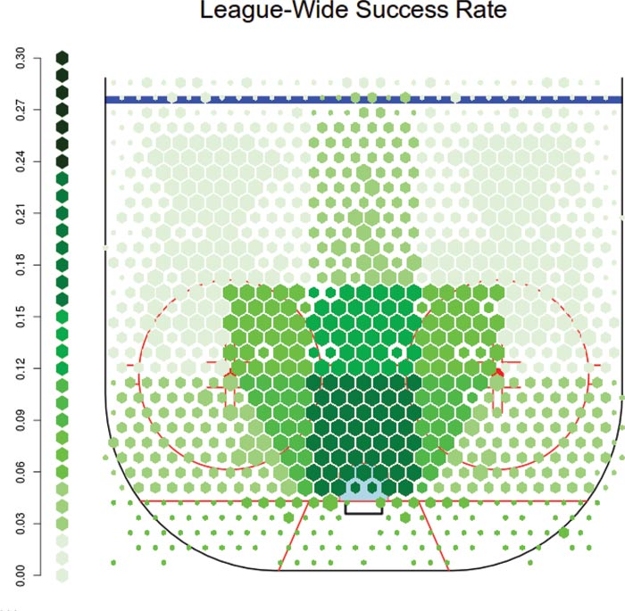
Figure 1. The success rate of taking shots in the NHL from each position on the ice, binned by general shooting region. Note that the ‘home plate’ area in the middle shows a dramatically higher success probability; this is an area that many analysts describe as the ‘scoring chance’ area.
This binning makes it clear where the successful shooting locations are, mainly because most experienced hockey players would recognize them: close to the net with as straight an angle as possible. It also makes it clear that this region drives scoring in general—the more shots on goal that can be attempted close up, the more successful the team will be.
Team Performances
With baseline levels of shot frequency and success for each region, we can now start to evaluate individual units for their strengths and weaknesses. We can subdivide the data further by situation:
- Was the team playing on home ice or on the road?
- What type of shot was recorded by the scorer? Slap shots typically come far from the net; backhand attempts are much closer.
- Were both teams at full strength? We expect many more shots when a team has a man advantage and fewer when one of their players is in the penalty box and off the ice.
On top of this, our color scheme can reflect either some desired thresholds of quality or statistically significant differences in rates between a team and the rest of the league. And here is the greatest benefit with this kind of binning: it can estimate two-dimensional systematic bias in the locations of recorded shots, if only regionally.
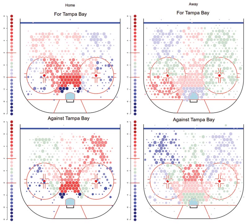
Figure 2a. Left—Shots for and against the Tampa Bay Lightning at their home arena. The ‘force field’ around the net is not observed for games on the road. Right—Tampa Bay again, on the road, where this phenomenon disappears.
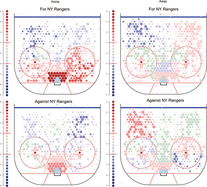
Figure 2b. Left—Shots for and against the New York Rangers at their home arena. The high rate of close shots by both teams is not found on the road, seen on the right.
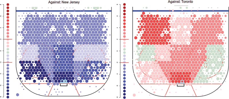
Figure 3. Left—Shots against the New Jersey Devils at even strength happen at rates well below the league average, from no matter what area of the ice they are taken. Right—The Toronto Maple Leafs have the opposite pattern, allowing shots from all areas of the ice at or above the league average.
There are a number of possible ways to mitigate the arena bias. The simplest is to assume that the fraction of shots of a particular type—slap, wrist, backhand—in each region is the same at home as away, and that the scorer’s bias is equally applied to both teams, so I impute a fraction of the shots recorded in each zone to now be located in a neighboring zone so that this balance is respected.
Some of the conclusions we can draw were known fairly well before a single graphic made an appearance, but the graphics enhance them: the New Jersey Devils are excellent at preventing shots from all areas of the ice, but have particular skill at doing this close to the crease. The Toronto Maple Leafs, conversely, are known for allowing a large number of shots. Team executives claim that they “push” shots to the outside, but there is still a large concentration of shots close to the net. Notably, this effect is not apparent when Toronto’s rink bias is uncorrected, which suggests that those statements may have been supported by this biased source.
Player Performances
Plotting the individual shots for each player shows us two things: first, a typical NHL player is far more confined to a location and role than LeBron James in the NBA is, and second, the lack of volume in shots makes density estimation problematic. Hockey, however, gives far more credit for plays that lead to goals than basketball does, and the role of the superstar is measurably less important when the roster is double the size. Comparing the rate of an individual’s shots is also counterproductive if there is a high number, but they come at the expense of scoring opportunities for the rest of the team.
We can establish a reliable comparison test for a player by contrasting how the team performs with that player in the game against how they perform when that player is on the bench or absent. This is a variety of what hockey analysts call WOWYs, or “with-or-without-you” statistics, though in this case we look at the whole team rather than a series of achievements by selected teammates. We can do this for both offense and defense in terms of location-based shot differential, and combine the two for a total contribution to the team relative to the team average.
Figures 4 and 5 illustrate two extreme styles that teams can employ, depending on the skills of the players involved. On the left is the shooting success rate of Steven Stamkos and the total rate of team shots by the Lightning when he is on the ice; Stamkos’s skill in converting shots into goals is considerably above league average, statistically significantly so. A team that can get the puck to Stamkos will be more successful in scoring, rather than focusing on high rates of shots by average shooters; these do happen in several areas of the rink, but not ones in which Stamkos himself takes the majority of his shots.
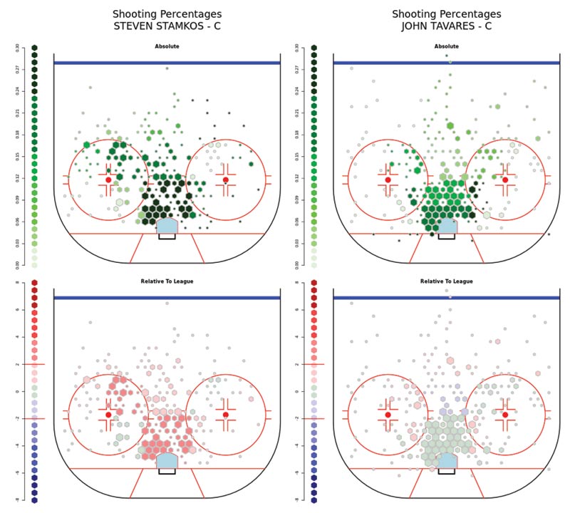
Figure 4. Shooting percentages for Steven Stamkos of the Tampa Bay Lightning (left) and John Tavares of the New York Islanders over three seasons. Stamkos in particular is known as a highly efficient shooter, so the relatively modest level of statistical significance is striking.
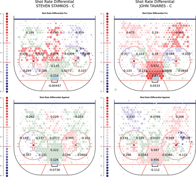
Figure 5. Shooting rates for the Lightning when Steven Stamkos is on the ice (left), and for the New York Islanders when John Tavares is on the ice. A difference in approach is clear: more higher-quality shots taken by Stamkos drive Lightning team scoring, compared to a larger number of average-quality shots driving Tavares’s style of play.
On the right is John Tavares of the Islanders, who is an average shooter but excels at driving up the rates of high-value shots by his team. While both of these skills are known to NHL coaches, it is easier to prove that the rate-increase strategy works, due simply to the sheer number of events compared to the individual success probability for a single shooter.
You Can Do It!
The NHL data and analysis method are available for public consumption; the data can be downloaded and processed with the R package nhlscrapr, and the graphical methods have been implemented as “Hextally,” available as a trio of apps. The number of situations in the data is far greater than what a single article can contain: for example, even-strength and power-play/penalty-kill situations, across nine seasons, for all 30 teams and anyone who has attempted at least five shots on goal.
We all hope that the data available in future seasons will be superior to that from the past six seasons, and that the rumors of higher-resolution data systems for common use are not merely the hopes of researchers like us who crave what they can provide. This does not mean that the value of public data will ever disappear, or that this new frontier won’t provide a number of graphical challenges. Plotting player trajectories on ice, for example, is an understudied problem that will need simplifying assumptions for any kind of meaningful data extraction, let alone statistical correction, and the more this data becomes available, the better we’ll be able to understand the game.
About the Author
Andrew C. Thomas is an associate professor of data science at the University of Florida. He earned his PhD in statistics from Harvard University. His primary research interests focus on the stochastic modeling of ties and individual attributes for complex networks. Included in his many secondary interests is the modeling of sports and games. He serves on the editorial boards of the Journal of Quantitative Analysis in Sports and Statistics and Public Policy.

A Statistician Reads the Sports Pages takes a statistical look at sports. If you are interested in submitting an article, please contact Shane Jensen, column editor, at stjensen@wharton.upenn.edu.