
Can Nick Kyrgios Be a Tennis Champion?
 Nick Kyrgios shocked the tennis world on July 1, 2014, by beating world number one, Rafael Nadal. This was the fourth round of the tournament, and he had already beaten the 13th seed, Richard Gasquet, to get this far.
We can take a look at this very quickly by scraping data from the Wimbledon website using the R package XML. The statistics available include aces, double faults, % first serves in, % first and second serves won, fastest serve speed, average first and second serve speed, net points won, break points won, receiving points won, winners, and unforced errors.
For this article, I have scraped the statistics for the matches of the first two rounds of the tournament. If a player made it through to the second round, their statistics for the two matches are averaged. We could average the stats for all the matches a player plays, but we get a sense of how they are playing early in the tournament by using just the first two rounds. The statistics will be plotted against the round the player reached to see what it takes to become a champion.
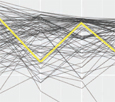
Instead of plotting these statistics in isolation, we will embed the plots into a lineup of 20 plots. All plots will use the same data, but one of the variables will have been permuted against the other in 19 of these plots so any association between the variables is broken. If the plot of the actual data stands out against the rest, then the association between the variables is significant and the statistic is important for predicting performance. Figures 1–4 show lineups of four statistics. For each of these lineups, pick the plot that is the most different from the others in the array. Do this before reading the next few paragraphs.
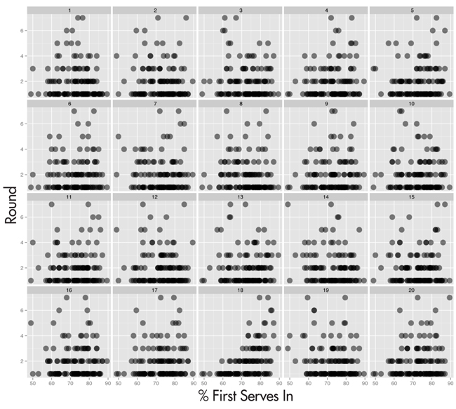
Figure 1. Lineup of round reached against % first serves in. Which plot is the most different from the rest?
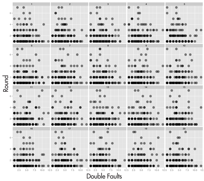
Figure 2. Lineup of round reached against number of double faults. Which plot is the most different?
Figure 3. Lineup of round reached against % second serve points won. Which plot is the most different?
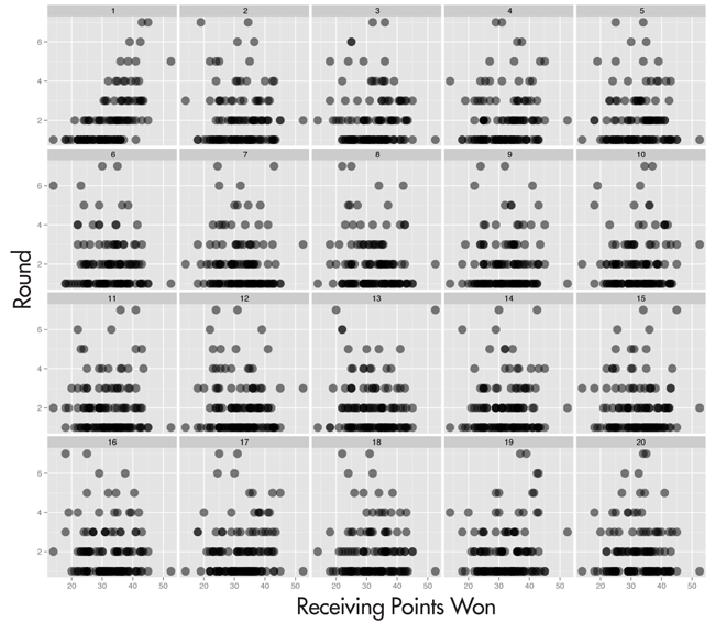
Figure 4. Lineup of round reached against number of receiving points won. Which plot is the most different from the rest?
I showed these lineups to the audience during a talk at ASC/IMS in Sydney July 10, 2014. Audience members with a wireless connection, 21 in all, entered their choices into a Wufoo survey. Details of their choices are shown in Figure 5. Overwhelmingly, people picked plot 18 in lineup 1, plot 5 in lineup 3, and plot 1 in lineup 4. For the second lineup, picks were evenly split between several plots. The actual data is in positions 18, 5, 5, and 1, respectively. People picked the actual data overwhelmingly in all lineups except the second. This says that success in the tournament was significantly related to % first serves in, % second serves won, and receiving points won, but not so much with double faults. Even though it wasn’t an overwhelming pick, the actual data plot was still in the mix of picks in lineup 2 and is marginally statistically significant.
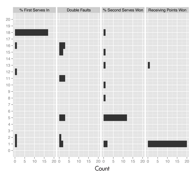
Figure 5. Responses from audience members for each of the lineups in Figures 1–4. The picks were definitive for % first serves in, % second serves won, and receiving points won. This says the association between round achieved and these three statistics is very strong, and they are important for being successful in the tournament. For double faults, it is more of a mixed bag. The actual data plot is one of the selected plots, but clearly people saw structure in some of the null plots as well. The relationship between double faults and success in the tournament is much weaker, although still important.
If you would like to read more about these inference methods for graphics, pick up a copy of the December 2013 issue of the Journal of the American Statistical Association and read the article by Mahbubul Majumder and colleagues.
This allows us to say something about Nick Kyrgios’ statistics, at least these four statistics, relative to other competitors. So let’s take a look. How was he doing relative to other final round players in the early part of the tournament? Figure 6 shows plots of the statistics against round, with Kyrgios’ values highlighted (square), and Table 1 shows the values.
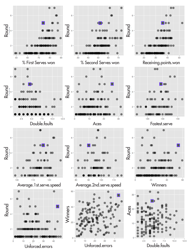
Figure 6. Nick’s stats (highlighted by a square) in relation to other competitors. His stats were similar to other players who made the quarterfinals, but clearly with room for improvement to be a contender for champion. For example, the percentage of first serves won (top left plot) was high, but on the low side compared to other players who made the quarterfinals

Table 1—Statistics for the Top Players in the World and Nick Kyrgios, Averaged for the Frst Two Rounds of Wimbledon
Kyrgios was in the range of the other competitors who made it through to the quarterfinals during his play in the first two round matches. His % first serves won was 74%, which is in the range of others who made it to Round 4, but lower than the semi-finalists. His second serve winning % is also high relative to most competitors, but low by the semifinalists. Similarly for receiving points won. On double faults he is well within the range of the players making the final rounds.
Looking at the other statistics, Kyrgios hits a lot of aces, but the top players—Djokovic and Federer—do not build their games on aces. Kyrgios has a high ratio of aces to double faults, which is a good thing. His serve is fast, but not that fast, so the aces must come partially from good placement. His second serve is on the slow side, and he has a low % of second serves won, indicating an area where he could improve his game. Kyrgios is off the charts on his winners, particularly in comparison to other quarterfinalists, but he is also off the charts on unforced errors. It seems like he went out on the court to “have a good bash”! But his ratio of winners to unforced errors is greater than one, so although he was pushing the limits, he was having a lot of success also. Interestingly, Federer was making a lot of unforced errors in these first two rounds, too.
In summary, Kyrgios looks like he has the potential to be a champion. He will need to develop his second serve and receiving game and reign in the errors. It will be interesting to see how he handles the next few tournaments, particularly now that he will have a lot of people watching. I wasn’t too happy to see him smash his racquet when he lost some points to Milos Raonic in Round 5. Keeping this temper under control will be important for the future, too.
Sports is an exciting application of statistics. There are a lot of data available on the Web. The R packages XML and scrapeR make it possible to extract the data into R, from which we can conduct an expedition of discovery. Graphics make it possible to explore the data, to slice and dice in different ways that predictive modeling does not. The new inferential methods for quantifying findings from graphics help the exploratory process by giving support for finding unusual relationships in the data.
I really like tennis, because the women’s game is given as much importance as the men’s. For this, we have to thank the women playing in the 1960s and 1970s who steadfastly refused to let the women’s tournaments be relegated to second place. If you get a chance, watch the documentary “The Battle of the Sexes,” which is a fabulous movie about the match between Billie Jean King and Bobby Riggs despite the unfortunate title. I saw this on a plane to Australia this summer.
Editor’s Note: Analysis was made possible with the R packages ggplot2 and nullabor. Data were collected using XML and scrapeR.
About the Author
Dianne Cook is a professor of statistics at Iowa State University and an ASA Fellow. Her primary research interest is on visualizing data using interactive graphics. She earned her PhD from Rutgers University in 1993, while working closely with researchers at Bellcore, on grand tour and projection pursuit methods, implemented in the software XGobi. At ISU, she teaches data mining, multivariate analysis, data technologies, and introductory statistics, and she works with graduate students in the Human Computer Interaction program and bioinformatics and computational biology programs.
 For the love of graphics, Visiphilia covers the practice, developments, and innovations in statistical graphics; the interplay between statistics, computer science, and information visualization; and the effective use of visualization in statistical practice.
[/restrict]