
Symbolic Data Analysis

I went back to school this past spring semester. To be more precise, I sat in on a special topics course on symbolic data analysis offered by one of my colleagues who is a pioneer in this topic.
I have been interested in the notion of variant data objects for some time, due primarily, although not solely, to my work in brain imaging. There, the analysis is typically done at the level of the volumetric element, or voxel, in spite of voxels having no intrinsic meaning, being artifacts of the way in which the data are collected and far removed from the neuronal level that is actually of interest.
Currently, we are not able to get to that level of data, at least not in humans. Perhaps, then, we can move in the opposite direction and the unit of analysis should be larger—the entire image, for example. But if we take the image as the “data point,” how should it be analyzed? With this perspective, we move into the realm of alternate data types (i.e., object-oriented, or symbolic, or functional data), all of which have seen an explosion of recent interest. Of course, I was eager to take advantage of this unique opportunity to learn about a new and developing area of statistics.
What are symbolic data, and how do they arise? The main ways in which you might find yourself with symbolic, as opposed to classical, data are via aggregation of a large data set, when the research questions of interest center on classes or groups rather than individuals; they may be naturally occurring; government (e.g. census) data not given at the level of individuals; from confidentialities imposed on the data.
We’ll consider each of these in turn, with examples to demonstrate the richness of this class of data type.
Symbolic data as a result of aggregation can come about when the research questions of interest do not involve individual units, but rather collections, or classes, of units. For example, in a large medical data set, interest may center on 50-year-old males with liver cancer. All the 50-year-old males with liver cancer in the data set will be aggregated, and their characteristics combined into “objects.” Some possibilities include alcohol consumption (giving a breakdown of ranges of values for consumption, along with relative frequencies of those categories in the sample); weight (ditto); smoking status; and so on.
Or, patient pathways might be of interest: How do patients with myocardial infarction who are first admitted to a teaching hospital, then transferred to another, fare compared to those who go directly to a non-teaching hospital? And how are these outcomes affected by age, smoking status, weight, etc.?
Note that classical data are a special case of this type of symbolic data, in which each category has just a single unit. And it’s worth also noting that this is not just a theoretical conjuring up of a new data type; in practice, we may very well be given such aggregated data from a collaborator or client, rather than the complete data set. It is also important to emphasize that all of the original data are used here, just not in their original form; the aggregation may be driven by the questions of scientific interest.
Naturally occurring symbolic data often arise from the study of species; animals or plants are good examples. Instantiations of a certain species of mushroom will not all have precisely the same size. Instead, a range of cap widths, stipe lengths, and stipe thicknesses are found in nature. The data you have for a species of mushroom are intervals. For instance, the stipe length for the californicus mushroom is [3.0, 7.0] cm. Unlike the previous case, here there are no unaggregated data to fall back on and we have to contend with interval values as our natural data points. Another example of this type is temperature on a given day, which fluctuates over a range of values. We could try to summarize the temperature on a particular day by taking the mean or the median, but this obviously loses a lot of information.
Government data are often given in categories and intervals. Furthermore, most of us don’t have access to individual records because of confidentiality issues. Consider data from the U.S. Census. You can download lots of census information from www.census.gov, but it doesn’t come as individual records. Instead, what you will get are aggregated tables of data, sometimes even with extra “noise” or jitter added in to protect individuals whose characteristics are so specific as to make them identifiable from a summary table.
Other variables of interest to researchers may be sensitive from the point of view of respondents. A well-known example is income. Many people are reluctant to report their exact income on a survey or questionnaire. So survey designers, as we’ve all experienced, will ask about the range of income instead. In this case, the exact values are not available, but we would still like to analyze income information. Age is another variable of this sort.
Symbolic data are not themselves of a single type; they can take various forms, some of which I have already mentioned. The most commonly analyzed to date are: multi-valued lists, intervals, and histograms. Multi-valued lists will often consist of values for categorical variables, for instance smoking status can be ({current, former, never}). Any given individual will experience one value from the list. A collection of individuals with a given characteristic, say, 35-year-old women, will split according to the number or proportion in a given sample taking on each of the possible values. In other cases, individuals may take on more than one value in the list. Consider colors of tropical birds. The quetzal is a colorful bird found in Mexico and Guatemala. Parts of their bodies are iridescent green or golden-green; other parts are red; still others may be gray or brown. A list of color values for the quetzal would be ({green, red, gray, brown}). Here, it is important to take the list as a whole for our covariate. A bird that has some of these colors in its plumage but not others would not be a quetzal!
Interval-valued data are like the mushroom example—the variable naturally takes a range of characteristic values; the unit of analysis will be the species of mushroom, not a specific individual. In other instances, we may obtain an interval of values by aggregating the data over an individual, or over a group of individuals. In either case, if we ignore the interval nature of the variable, we throw out potentially valuable information.
As for histogram data, here, too, different types are possible. One variant is what is called “list modal” data; this is built on lists, but now with the addition of relative frequency or weights for each category. In the smoking status example, the basic list would be augmented with proportions of each level [e.g., ({current, 0.3; former, 0.2; never, 0.5})]. There are also “interval modal” histogram data, in which each interval from a continuous variable is assigned a weight or relative proportion. For example, we could build a histogram of cholesterol levels by region. Interest would center on differences in the distribution of cholesterol across the regions in the study. Clearly, just taking the mean of each region, or even the midpoint of each histogram bin, results in a tremendous loss of information. The problem is not necessarily alleviated by “unagglomerating” the data from histogram to empirical distribution function (i.e., retaining all of the observed values). If we take the latter approach, we still are faced with the question of how to compare entire curves of data—bringing us into the domain of functional data analysis. Here, too, there are many open questions.
Indeed, it was exactly this question that had led me to sit in on the class in the first place. Some time back, a colleague in the college of education approached me with a vexing—and very interesting—problem. She was apologetic for the small data set, just 16 subjects. For each subject, however, she had multiple measurements over time, taken roughly every two weeks. Moreover—and here’s where it got interesting—at each point in time, she had hundreds of observations, giving the distribution of her variable of interest. The research question was whether the distributions changed over time. When she first asked me about this data set and ways to analyze it, she mentioned that people in her field commonly would take the mean of the observations, but she (and others) felt that this was throwing too much of the raw data away; and, not surprisingly, it was hard to detect any changes in the distribution based just on the mean, or any other one number summary. A theme throughout the semester in the lectures on the symbolic data analysis approach was precisely that simply taking the mean of these types of more highly complex structured data was not the optimal thing to do—that is obvious to any practitioner. What is far less obvious is what to do about it. One of my PhD students is now working on an analysis of this initial data set from a symbolic perspective for his doctoral research.
The easiest way to understand the difference between treating data classically and symbolically is to look at a picture. Figures 1 and 2 show scatterplots of the interval-valued symbolic mushroom data, comparing stipe length and stipe thickness for each of 12 species. In Figure 1, I have plotted the pairs (center of stipe length interval, center of stipe thickness interval), whereas in Figure 2, I have plotted the intervals themselves. Note that each data “point” is actually a rectangle now. The qualitative impressions provided by the two scatterplots are only vaguely similar. From Figure 1, there is not much of a relation apparent between the two variables. Figure 2 gives a much richer visualization; we can see first of all that there is a substantial amount of overlap among the different mushroom species. Furthermore, some species are quite variable along both dimensions, others are variable along one, and still others exhibit a small amount of variability. It’s not obvious even now if there is a relationship between stipe length and stipe thickness, but at least we have a fuller understanding of the two variables and how they interact.
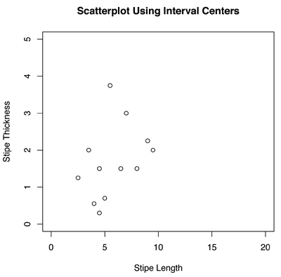
Figure 1. Scatterplot of stipe length and stipe thickness values for different species of mushrooms. Here, the centers of the intervals are taken to be the data points and plotted. Each point represents one species.
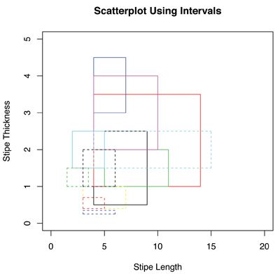
Figure 2. Scatterplot of stipe length and stipe thickness interval values of different species of mushrooms. Both variables are interval-valued data, so when plotted jointly, each species is represented by a rectangle.
This example demonstrates one of the main difficulties with taking the midpoint of an interval to be representative of the whole, which might be our first inclination upon encountering data of this sort: there is a tremendous loss of information about the variance. Consider the two intervals [22.0, 26.0] and [14.0, 34.0]. Both have 24 as their center, but the width of the second interval is five times greater than the width of the first. It is wasteful and potentially misleading to treat both of these as the same. In addition, “underneath” symbolic data there are often classical data, even if we don’t have access to them and even if they are not the unit of true interest. What is the distribution of the variable across the interval? When we take the midpoint, we are implicitly assuming that the distribution is symmetric, which may or may not be true. Actually, for the purpose of analysis, it is usually assumed that the distribution across an interval or across a histogram bin is uniform. Of course there is no way to test this assumption in most instances; at best we can perhaps assess the implication of a uniformity assumption via simulation.
Methods are being developed specifically for analyzing interval-valued data, in which the endpoints as well as the centers are taken into account. Summary statistics have been worked out, and there is a lot of research on regression, clustering, and other basic methodologies. Similarly, researchers are developing methodology for the analysis of list and histogram data. In all of these cases, the goal is to find symbolic versions of common statistical techniques that respect the qualities of the data—fitting the model to the data, rather than manipulating the data to conform to an existing model. The details are complicated; see some of the suggested further readings to learn more about how the analysis is actually carried out. And, of course, there is still a great need to develop theory for symbolic data, a topic that is very much in its infancy.
A variety of analytical issues make the analysis of symbolic data challenging. Among these are the following:
Internal variation. As already described, for interval-valued and histogram-valued data, there is variation between observations (as is the case for classical data too, of course) and within an observation. An interval of [40, 44], with a midpoint of 42, is not the same as the simple value 42. It is important to take the internal variation into account in the analysis. How to do that is not altogether clear once we move away from relatively simple summary statistics.
Logical dependencies. Especially when we are dealing with symbolic data that come about from aggregating into intervals, we need to take care that illogical/impossible categories are not defined between variables. For example, if we have data on age and number of children, prepubertal age categories must have “number of children = 0”; we might need to be careful in our definition of age categories, but the point is that we cannot introduce logical fallacies to variables when considered in a multivariate way.
Sub-interval distributions. It is convenient to assume that the values within a sub-interval are uniformly distributed, but this may not be the case. Most current methods for symbolic data make this assumption. An open question is how would the analysis proceed with a different distributional assumption, or none at all?
Symbolic output. The result of a symbolic data analysis may be classical (i.e., a point value). But it may also be symbolic. This raises questions of interpretation, which are, themselves, nontrivial.
Is this truly a Big Data approach? I’d argue that it is, even if an individual data set may not fall into the category of Big Data. The reasons for this are two-fold. First, as I described at the beginning of this column, symbolic data may arise through a process of aggregating a truly huge data set, perhaps one that is too large to conveniently store and analyze. More importantly, I think, is the second reason, namely that a characteristic of modern large-scale data sets is that they often have a nontraditional form. New statistical methodologies with radically new ways of thinking about data are required. If you ever want to bend your brain, think about building a histogram of histogram-valued data! In that very important sense, symbolic data analysis can be considered a method for Big Data.
The students in the class clearly felt energized and excited by these new ideas. During each lecture, someone would be “sparked” to raise questions that were avenues for new research. At times, the students would break off into little discussion groups, as they argued with each other over the best way to prove some result, or what it really meant to perform some procedure in a certain way. It was probably one of the more intellectually stimulating classroom experiences I have had in a while.
Further Reading
Billard, L., and E. Diday. 2003. From the statistics of data to the statistics of knowledge: Symbolic data analysis. Journal of the American Statistical Association 98:470–487.
Billard, L., and E. Diday. 2006. Symbolic data analysis: Conceptual statistics and data mining. Chichester: Wiley.
Billard, L. 2011. Brief overview of symbolic data and analytic issues. Statistical Analysis and Data Mining 4:149–156.
About the Author
Nicole Lazar earned her PhD from The University of Chicago. She is a professor in the department of statistics at the University of Georgia, and her research interests include the statistical analysis of neuroimaging data, empirical likelihood and other likelihood methods, and data visualization. She also is an associate editor of The American Statistician and The Annals of Applied Statistics and the author of The Statistical Analysis of Functional MRI Data.
Hi Nicole Lazar
You said
“symbolic data analysis can be considered a method for Big Data.”
I agree completely. You could say also that it is a method for the cloud and the open source data.
I have appreciate much your paper; I hope you will join our next workshop on SDA in Taiwan june 2014.
Best
Edwin Diday Prof Paris Dauphine University.